Combobox
Combobox group component
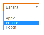
The combobox offers values from a provided value list in a dropdown list. When the value list offers display and return values, the return value is returned to the dataprovider. Note that if your value list does not have the "Allow empty value" check set, a user won't be able to empty the field anymore.
Table of contents
The component has the following properties:
| Property | Type | Default | Description |
|---|---|---|---|
| dataProvider | dataprovider | The dataprovider of the component | |
| enabled | Boolean | true | Whether the component is enabled or not; blocks onAction, onDataChange events. |
| placeholderText | String | Text shown when no value is yet selected (i18n is supported) | |
| styleClass | String | Style class of this component | |
| tabSeq | Number | Tab sequence index of the form | |
| text | String | The text shown as label next to the check | |
| toolTipText | String | Tooltip text shown when hovering over the component (i18n is supported) | |
| valuelist | valuelist | The value list which offers the values presented | |
| visible | Boolean | true | Whether the component is visible or not |
The component allows to attach handlers for the following events:
| Event | Parameters | Return | Description |
|---|---|---|---|
| onAction | event:JSEvent | Fired when the enter key is hit | |
| onDataChange | oldValue:Date, newValue:Date, event:JSEvent | Boolean | Fired when the value is changed |
| onFocusGained | event:JSEvent | Fired when the component gets focus | |
| onFocusLost | event:JSEvent | Fired when the component loses focus |
The component offers the following API methods:
| Method | Parameters | Return | Description |
|---|---|---|---|
| requestFocus | mustExecuteOnFocusGainedMethod:Boolean | Sets the focus to this component. |