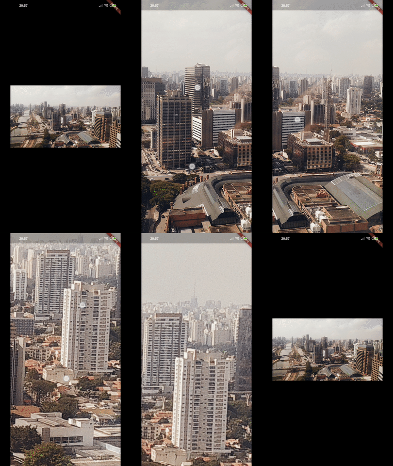
A simple zoomable image/content widget for Flutter.
PhotoView enables images to become able to zoom and pan with user gestures such as pinch, rotate and drag.
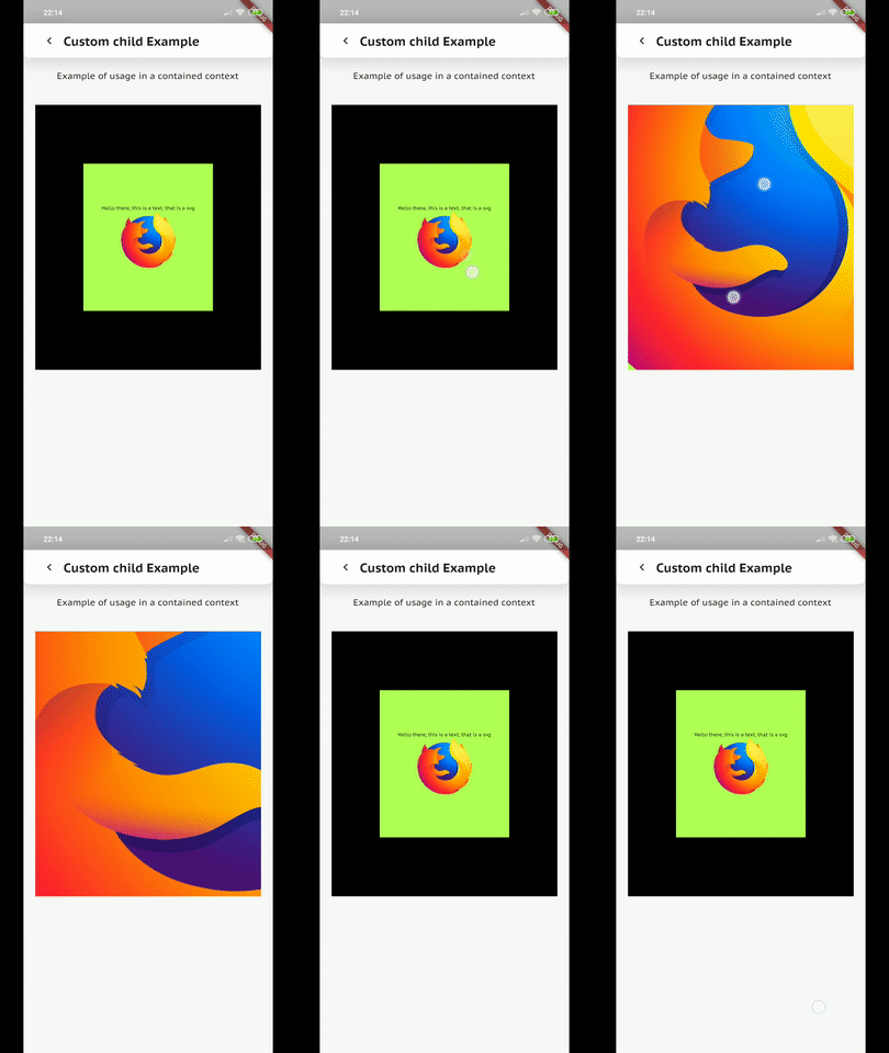
It also can show any widget instead of an image, such as Container, Text or a SVG.
Even though being super simple to use, PhotoView is extremely customizable though its options and the controllers.
Add photo_view as a dependency in your pubspec.yaml file.
Import Photo View:
import 'package:photo_view/photo_view.dart';The API Docs some detailed information about how to use PhotoView.
If you want to see it in practice, check the example app that explores most of Photo View's use cases or download the latest version apk on the releases page
Given a ImageProvider imageProvider (such as AssetImage or NetworkImage):
@override
Widget build(BuildContext context) {
  return Container(
    child: PhotoView(
      imageProvider: AssetImage("assets/large-image.jpg"),
    )
  );
}
Result:
Read more about the PhotoView widget here.
To show several images and let user change between them, use PhotoViewGallery.
Read more about the gallery here.
import 'package:photo_view/photo_view.dart';
import 'package:photo_view/photo_view_gallery.dart';
// ...


@override
Widget build(BuildContext context) {
  return Container(
    child: PhotoViewGallery.builder(
      scrollPhysics: const BouncingScrollPhysics(),
      builder: (BuildContext context, int index) {
        return PhotoViewGalleryPageOptions(
          imageProvider: AssetImage(widget.galleryItems[index].image),
          initialScale: PhotoViewComputedScale.contained * 0.8,
          heroAttributes: PhotoViewHeroAttributes(tag: galleryItems[index].id),
        );
      },
      itemCount: galleryItems.length,
      loadingBuilder: (context, event) => Center(
        child: Container(
          width: 20.0,
          height: 20.0,
          child: CircularProgressIndicator(
            value: event == null
                ? 0
                : event.cumulativeBytesLoaded / event.expectedTotalBytes,
          ),
        ),
      ),
      backgroundDecoration: widget.backgroundDecoration,
      pageController: widget.pageController,
      onPageChanged: onPageChanged,
    )
  );
}
Gallery sample in the example app:
See the code here.
When you need to interact with PhotoView's internal state values, PhotoViewController and PhotoViewScaleStateController are the way to.
Controllers, when specified to PhotoView widget, enables the author(you) to listen for state updates through a Stream and change those values externally.
Read more about controllers here.
In the example app, we can see what can be achieved with controllers:
| Custom background, small image and custom alignment |
Limited scale | Hero animation |
|---|---|---|
 |
 |
 |
| Part of the screen | Custom child | |
 |
 |
You can support us by becoming a patron on Patreon, any support is much appreciated.


