数据集采用 plotly.data.tips(),一个记录了餐馆营业信息的dataframe(包括244行与7个变量):
['total_bill', 'tip', 'sex', 'smoker', 'day', 'time', 'size']
在条形图的例子中使用plotly两种不同的绘图函数进行举例,本教程主要使用plotly.graph_objects进行绘图,plotly.express可供参考。
在plotly.graph_objects的绘图方法下,条形图通过函数go.Bar( )进行绘制,Barmode='group' or 'stack'(堆叠图)
import plotly
import plotly.graph_objects as go
import numpy as np
import pandas as pd
from pandas import DataFrame
from plotly.subplots import make_subplots

#数据
df=plotly.data.tips()
new_df2 = df.groupby(['day','smoker'])[['tip']].mean()
new_df2=new_df2.reset_index()
df1,df2=new_df2.query("smoker=='No'"),new_df2.query("smoker=='Yes'")

#创建图形对象
fig = go.Figure()
#第一步:画图形
fig.add_trace(go.Bar(x=df1['day'],y=df1['tip'],name='Non-smokers',marker_color='rgb(253,180,98)'))
fig.add_trace(go.Bar(x=df2['day'],y=df2['tip'],name='Smokers',marker_color='rgb(179,222,105)'))
#第二步:编辑标题、标签、图例等
fig.update_layout(title='Who tips more? Non-smokers VS. Smokers',
                  xaxis_title='Day',yaxis_title='Avg of Tip (dollars)',
                  barmode='group',
                  xaxis={'categoryorder':'array','categoryarray':['Thur','Fri','Sat','Sun']}
                 )
fig.show()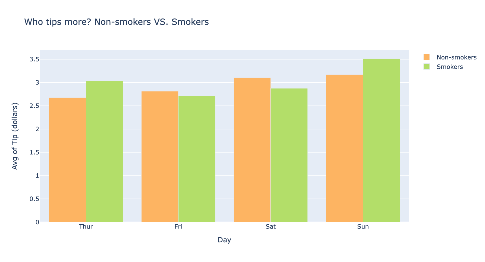
在plotly.express的绘图方法下,条形图通过函数px.Bar( )进行绘制,直方图通过px.histogram( )进行绘制。
plotly两种绘图方法比较: plotly.express与dataframe更好地结合,为复杂的图表提供了一个简单的语法;plotly.graph_objects需要对数据自行处理后绘图,但通过两个步骤进行绘图的方法使绘图过程条理清晰。histfunc默认为count,可设置为sum/avg/min/max,分别对y轴变量求和/平均/最小值/最大值。facet_col:分面函数,按照指定的变量对列进行分面。facet_row:分面函数,按照指定的变量对行进行分面。category_orders:对x、y轴变量的顺序排序。
import plotly.express as px
df = px.data.tips()
fig = px.histogram(df, x="sex", y="tip",
             histfunc="avg", color="smoker", barmode="group",
             facet_col="day",facet_row="time",
             color_discrete_map={"No": "rgb(253,180,98)", "Yes":"rgb(179,222,105)"},
             category_orders={"day": ["Thur", "Fri", "Sat", "Sun"],"time": ["Lunch", "Dinner"]})
fig.show()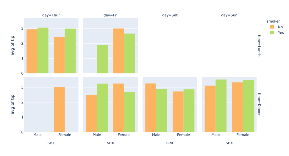
散点图通过函数go.Scatter( )进行绘制,散点的绘制通过限制参数mode为markers,通过字典marker=dict( )定义散点的大小、尺寸、配色方案(plotly配色方案可参考:https://plotly.com/python/builtin-colorscales/)
#数据
df=plotly.data.tips()
total_bill=df['total_bill']
tip=df['tip']
#创建图形对象
fig = go.Figure()
#第一步:画线
fig.add_trace(go.Scatter(x=total_bill,y=tip,
                         mode='markers',
                         marker=dict(
                             size=12,color=tip,colorscale='Sunset',showscale=True)) )
#第二步:编辑标题、标签、图例等
fig.update_layout(title='The relationship between Bill and Tip',
                   xaxis_title='Bill (dollars)', yaxis_title='Tip (dollars)')
fig.show()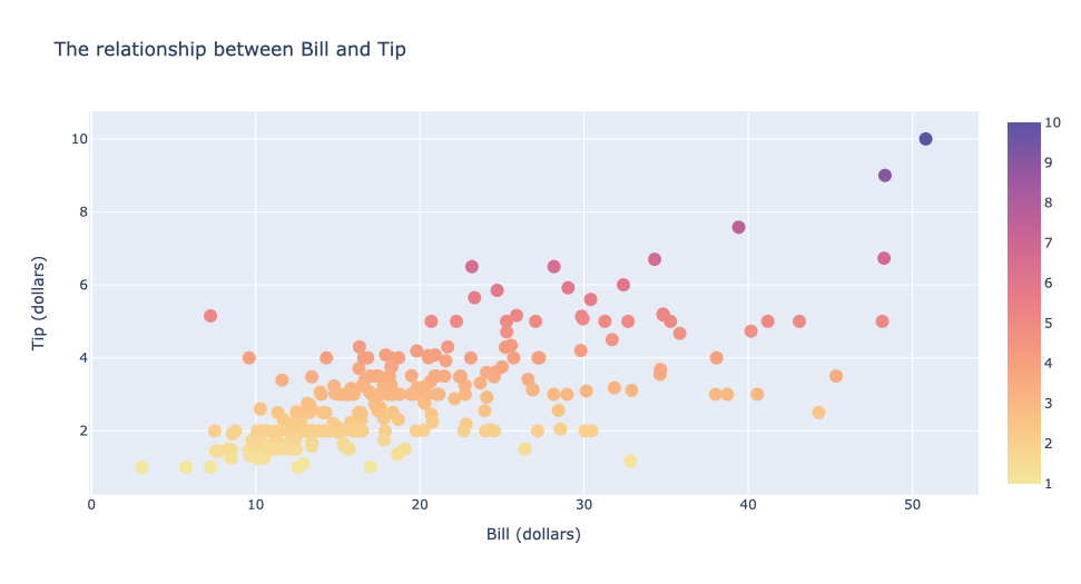
散点图用于探究两个变量之间的关系,点状图再多画一层至多层trace进行其他变量的比较。
#数据
df=plotly.data.tips()
df1,df2=df.query("sex=='Female'"),df.query("sex=='Male'")
bill1,bill2=df1['total_bill'],df2['total_bill']
tip1,tip2=df1['tip'],df2['tip']
#创建图形对象
fig = go.Figure()
#第一步:画线
fig.add_trace(go.Scatter(x=bill1,y=tip1,name='Female',mode="markers",marker=dict(color="rgb(251,128,144)", size=8)))
fig.add_trace(go.Scatter(x=bill2,y=tip2,name='Male',mode="markers",marker=dict(color="rgb(128,177,211)", size=8)))
#第二步:编辑标题、标签、图例等
fig.update_layout(title="The relationship between Bill and Tip. Female VS. Male",
xaxis_title='Bill (dollars)',yaxis_title='Tip (dollars)') 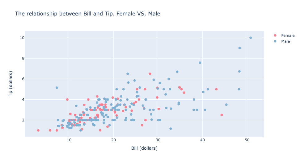
气泡图也是通过函数go.Scatter( )进行绘制,限制参数mode为markers,除此之外还需限制marker的尺寸从而调节气泡的大小
参数sizemodes有diameter和area这两个值,前者按照直径缩放,后者按照表示面积进行缩放。参数sizeref调节气泡的大小。当这个参数大于1时,将会减小气泡的大小;当这个参数小于1时,将增大气泡的大小。参数sizemin规定最小气泡的大小
#数据
df=plotly.data.tips()
total_bill=df['total_bill']
tip,size=df['tip'],df['size']
#创建图形对象
fig = go.Figure()
#第一步:画线
fig.add_trace(go.Scatter(x=total_bill,y=tip,
                         hovertemplate =      #气泡悬浮文本显示具体用餐人数
                         'Tip: $%{y:.2f}<br>'+'Bill: $%{x}<br>'+'用餐人数: %{text}</b>',
                         text = size,name='',
                         mode='markers',
                         marker=dict(
                             size=size,       #气泡大小随着size(用餐人数)的数值变化
                             sizemin=8, sizemode='area',sizeref=2.*max(size)/(40.**2),
                             color=tip, colorscale='Sunset', showscale=True
                         )))
#第二步:编辑标题、标签、图例等
fig.update_layout(title='The relationship between Bill,Tip and The number of diners',
                   xaxis_title='Bill (dollars)',yaxis_title='Tip (dollars)')
fig.show()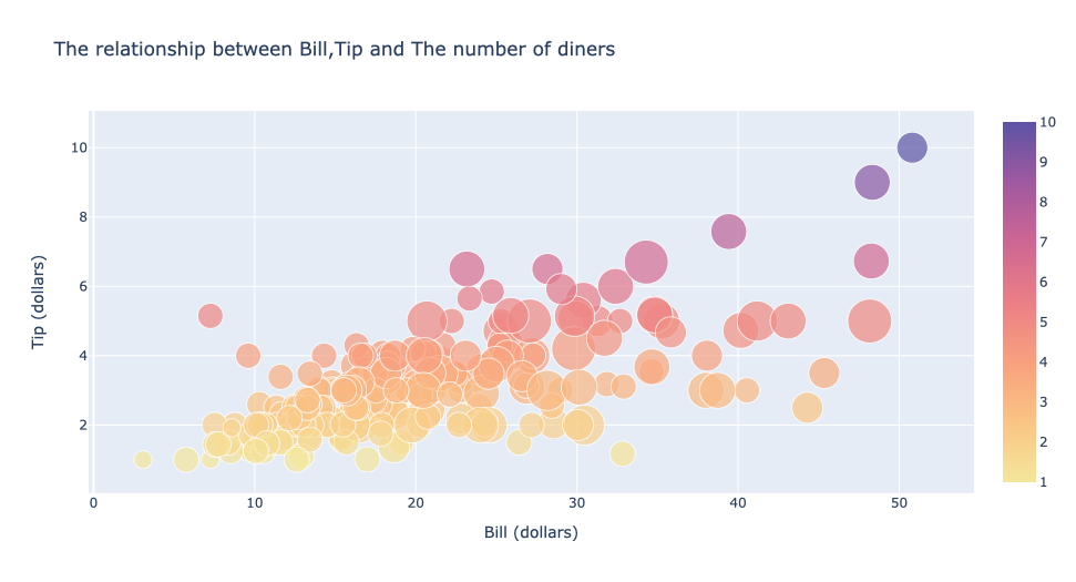
折线图还是通过函数go.Scatter( )进行绘制,两种限定直线形状的方式:一是设置参数mode;二是设置参数line的dash参数
mode可以选择lines/markers/lines+markers。dash可以选择dash/dot
#数据
df=plotly.data.tips()
grouped=df['tip'].groupby(df['day'])
new_df=grouped.sum()
new_df=new_df.reset_index()
day,tip=new_df['day'],new_df['tip']

#创建子图对象,x_title和y_title是在图表中居中的标签
fig = make_subplots(rows=2, cols=3,shared_yaxes=True,shared_xaxes=True,x_title="day", y_title="Tip(dollars)")

#第一步:画线
   #1.通过限定参数mode绘制直线
fig.add_trace(go.Scatter(x=day,y=tip, mode="lines",name='lines',line_color='rgb(252,141,98)'), row=1, col=1)
fig.add_trace(go.Scatter(x=day,y=tip, mode="markers",name='markers',line_color='rgb(252,141,98)'), row=1, col=2)
fig.add_trace(go.Scatter(x=day,y=tip, mode="lines+markers",name='lines+markers',line_color='rgb(252,141,98)'), row=1, col=3)
   #2.通过限定参数dash绘制直线
fig.add_trace(go.Scatter(x=day,y=tip, line = dict(color='rgb(102,194,165)', width=4, dash='dash'),name='dash'), row=2, col=1)
fig.add_trace(go.Scatter(x=day,y=tip, line = dict(color='rgb(102,194,165)', width=4, dash='dot'),name='dot'), row=2, col=2)
fig.add_trace(go.Scatter(x=day,y=tip, line=  dict(color='rgb(102,194,165)', width=4, dash='dashdot'),name='dashdot'), row=2, col=3)

#第二步:编辑标题、标签、图例等
fig.update_layout(title='The relationship between Day and Tip')
fig.show()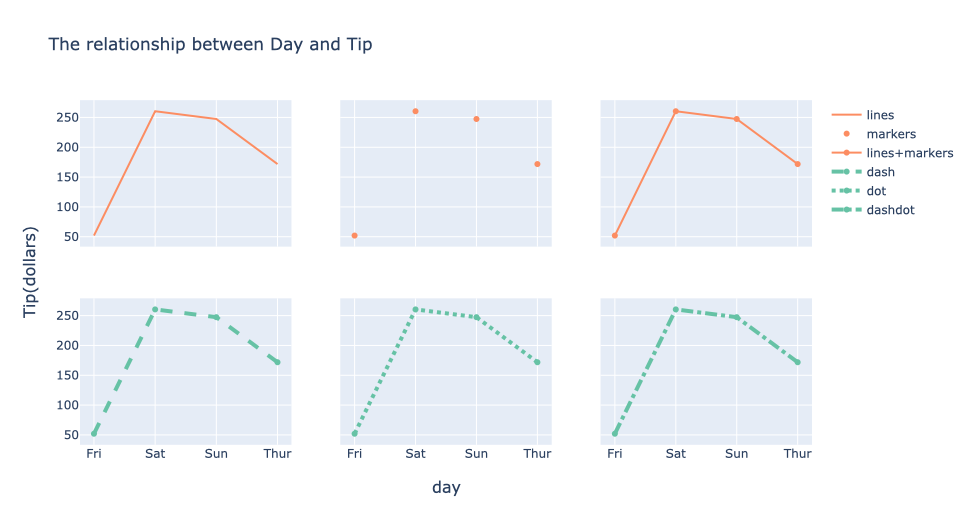
饼图通过函数go.Pie( )进行绘制
- 正常饼图
- 空心饼图:通过参数
hole限制空心大小 - 部分移出饼图:通过参数
pull限制哪一部分移出以及移出的距离
#数据
df=plotly.data.tips()
grouped=df['total_bill'].groupby(df['day'])
new_df=grouped.sum()
new_df=new_df.reset_index()
day,tip=new_df['day'],new_df['total_bill']

#定义饼图颜色列表
colors=['rgb(217,95,2)', 'rgb(252,141,98)','rgb(253,205,172)', 'rgb(166,86,40)']
#创建子图对象,饼图区域需要限制类型
fig = make_subplots(rows=1, cols=3, specs=[[{'type':'domain'}, {'type':'domain'}, {'type':'domain'}]])

#第一步:画图
fig.add_trace(go.Pie(labels=day, values=tip,marker_colors=colors, textinfo='label+percent'),row=1, col=1)
fig.add_trace(go.Pie(labels=day, values=tip,marker_colors=colors,hole=.3), row=1, col=2)
fig.add_trace(go.Pie(labels=day, values=tip,pull=[0.3, 0, 0, 0]), row=1, col=3)
#第二步:编辑标题、标签、图例等
fig.update_layout(title='The Bill In 4 Days')
fig.show()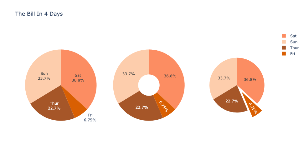
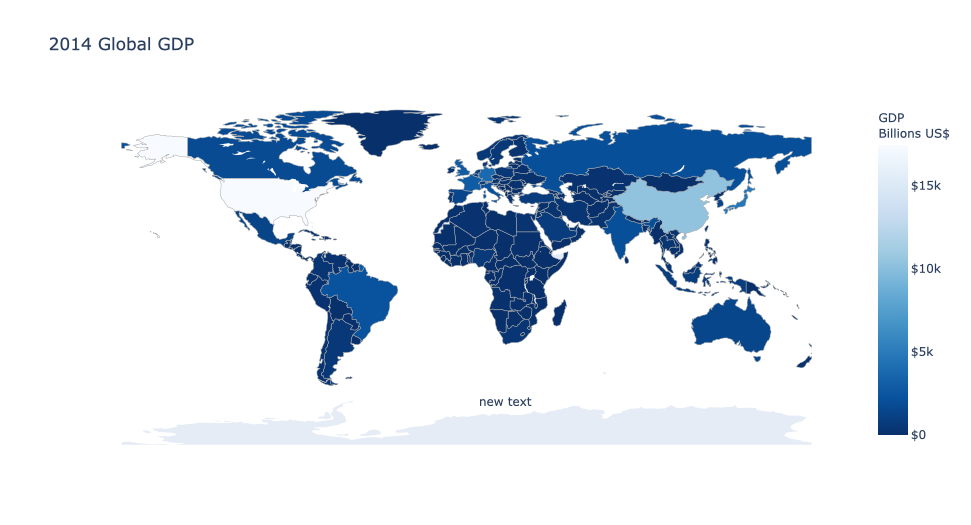
数据集采用2014年全球GDP数据,等值域图通过go.Choropleth( )进行绘制。通过参数location来限制地域,参数z对应等值区间。 geo规定地图的展示方式,包括区域与区域的边界、划线等,projection_type='equirectangular'表示地图采取等量矩形投影。
df = pd.read_csv('https://raw.githubusercontent.com/plotly/datasets/master/2014_world_gdp_with_codes.csv')
fig = go.Figure(data=go.Choropleth(
    locations = df['CODE'],z = df['GDP (BILLIONS)'],
    text = df['COUNTRY'],
    colorscale = 'Blues', autocolorscale=False, reversescale=True,
    colorbar_tickprefix = '$',colorbar_title = 'GDP<br>Billions US$',
    marker_line_color='darkgray',marker_line_width=0.5,
))

fig.update_layout(
    title_text='2014 Global GDP',
    geo=dict(showframe=False,showcoastlines=False,projection_type='equirectangular' ),
    annotations = [dict(x=0.55,y=0.1, xref='paper',yref='paper',showarrow = False )])

fig.show()
填充折线图图表的元类选择为 Scatter,重点在于 fill 属性,可以选择填充的区域。
后文所有配置,如无特别说明,均为 go.Scatter() 参数。
| 参数 | 含义 | 说明 |
|---|---|---|
fill |
填充模式 | tonexty 填充至上一个trace,tozeroy 填充至x轴,none不填充 |
mode |
边界模式 | None 为空边界,没有 marker 和 line |
stackgroup |
堆叠组 | 将想要堆叠合并的设为同一个堆叠组 |
groupnorm |
归一化 | percent 使得堆叠数据自动转换为百分数(实例2) |
填充折线图适合比较增量或者差距,第一种情况是比较两者的差,第二种情况是堆叠折线图,适合比较增量累计。
df = plotly.data.tips()
smoke = df[df['smoker'] == 'Yes'].groupby('day')[['tip']].mean()
non_smoke = df[df['smoker'] == 'No'].groupby('day')[['tip']].mean()
fig = go.Figure()
fig.add_trace(go.Scatter(x=smoke.index, y=smoke['tip'], fill='none', name='smoker'))  # fill down to xaxis
fig.add_trace(go.Scatter(x=non_smoke.index, y=non_smoke['tip'], fill='tonexty', name='non-smoker'))  # fill to trace0 y
fig.update_layout(title='Who tips more? Non-smokers VS. Smokers')
fig.show()| 实例1 | 实例2 |
|---|---|
 |
 |
fig = go.Figure()
fig.add_trace(go.Scatter(x=smoke.index, y=smoke['tip'], fill='tozeroy', name='smoker', stackgroup='smoking'))  # fill down to xaxis
fig.add_trace(go.Scatter(x=non_smoke.index, y=non_smoke['tip'], fill='tonexty', name='non-smoker', stackgroup='smoking'))  # fill to trace0 y
fig.update_layout(title='Tips By Day')
fig.show()水平柱状图 图表的元类选择为 Bar,重点在于 orientation 属性,用来选择 Bar 的方向,orientation='h' 表示水平图表。
水平 bar 和普通的 bar 具有平移性,参考前文
水平条形图适合横向的沿伸
fig = go.Figure(go.Bar(
  	x=[20, 14, 23],
    y=['giraffes', 'orangutans', 'monkeys'],
    orientation='h'))
fig.show()
旭日图 基于 go.Sunburst(),适合的数据结构类似 Dataframe 中的层次化索引(使用有一定冗余的线性数据结构),类似饼图和 Pie 图的升级版,且Sunburst 在层级化的基础上添加了很多交互功能。
| 参数 | 含义 | 说明 |
|---|---|---|
| ids | 节点 ID | 列表,每一个节点一个 ID |
| labels | 节点的显示标签 | 列表,可以不定义 ids,直接定义labels(不能重名!) |
| value | 权重 | 列表,配合 branchvalues 食用 |
| maxdepth | 展示深度 | |
| insidetextorientation | 字体方向 | |
| branchvalues | 花瓣的大小 | branchvalues = 'total' 表示按照 value 分配大小 |
注意两层级的映射关系,注意使用 margin = dict(t=0, l=0, r=0, b=0) 调整图表间距
Sunburst 的 go 版本数据结构非线性,难于书写,建议使用 px 版本搭配 pandas 一起食用。
fig = go.Figure(go.Sunburst(
    # label 和 id 的关系
    labels=["Tips", "Thur", "Fri", "Female-Thur", "Male-Thur", "Female-Fri", "Male-Fri"],
    parents=["", "Tips", "Tips", "Thur", "Thur", "Fri", "Fri"],
    values=[20, 10, 10, 6, 4, 5, 5],
    branchvalues = 'total'
))
fig.update_layout(margin=dict(t=0, l=0, r=0, b=0))
fig.show()| 实例1 | 实例2 |
|---|---|
 |
 |
Express 的版本非常简洁
df = px.data.tips()
fig = px.sunburst(df, path=['day', 'time', 'sex'], values='total_bill')
fig.show()非常鸡肋的表格,header 标题,cell 单元格(可以使用二维列表)
fig = go.Figure(data=[go.Table(header=dict(values=['Smoker', 'Non-Smoker']),
                               cells=dict(values=[smoke['tip'].round(2), non_smoke['tip'].round(2)]))])
fig.show()
Sankey 的元类是 go.Sankey,主要参数为 node 和 link
| 参数 | 项目 | 含义 | 说明 |
|---|---|---|---|
node |
label |
标签 | |
node |
pad |
间隔 | 流之间 |
node |
thickness |
厚度 | 节点的宽度 |
link |
source |
连接的出发点 | 列表,按照位置顺序的 id |
link |
target |
连接的目标点 | 同上 |
link |
value |
连接的权重 | 同上 |
Sankey 图擅长表示流的汇合与分支,可以用于信息流等流体在介质中的传播效果。
fig = go.Figure(data=[go.Sankey(
    node=dict(
        pad=20,  # 间隔
        thickness=20,  # 节点的宽度
        line=dict(color="black", width=0.5),
        label=["A1", "A2", "B1", "B2", "C1", "C2"],
        color="blue"),
    link=dict(
        source=[0, 1, 0, 2, 3, 3],
        target=[2, 3, 3, 4, 4, 5],
        value=[8, 4, 2, 8, 4, 2]))])
fig.show()| 实例1 | 实例2 |
|---|---|
 |
 |
在 node 中给每个 label 加入定位信息即可
fig = go.Figure(go.Sankey(
    arrangement="snap",
    node={
        "label": ["A", "B", "C", "D", "E", "F"],
        "x": [0.2, 0.1, 0.5, 0.7, 0.3, 0.5],
        "y": [0.7, 0.5, 0.2, 0.4, 0.2, 0.3],
        'pad': 10},  # 10 Pixels
    link={
        "source": [0, 0, 1, 2, 5, 4, 3, 5],
        "target": [5, 3, 4, 3, 0, 2, 2, 3],
        "value": [1, 2, 1, 1, 1, 1, 1, 2]}))
fig.show()
Treemap 树形图是由矩形构成的带有包含关系的图表,结构上和旭日图非常类似,把圆弧的周长换成了矩形的面积。
| 参数 | 含义 | 说明 |
|---|---|---|
| ids | 节点 ID | 列表,每一个节点一个 ID |
| labels | 节点的显示标签 | 列表,可以不定义 ids,直接定义labels(不能重名!) |
| value | 权重 | 列表,配合 branchvalues 食用 |
| branchvalues | 方块的大小 | branchvalues = 'total' 表示按照 value 分配大小 |
fig = go.Figure(go.Treemap(
    labels=["Tips", "Thur", "Fri", "Female-Thur", "Male-Thur", "Female-Fri", "Male-Fri"],
    parents=["", "Tips", "Tips", "Thur", "Thur", "Fri", "Fri"],
    values=[20, 10, 10, 6, 4, 5, 5],
    branchvalues = 'total'
))
fig.show()| 实例1 | 实例2 |
|---|---|
 |
 |
df = px.data.tips()
fig = px.treemap(df, path=['day', 'time', 'sex'], values='total_bill')
fig.show()