Speaker insights tab under Events provides you a complete insights on speakers who have participated in various events from your organization. The Speaker insights allows you to extract the information on the speakers in your organization, comparing your speakers who have attended various events with other organizations and many other information related to the speakers.
The following list provides you the complete details that can extracted from the Speaker Insights:
- Speaker widget
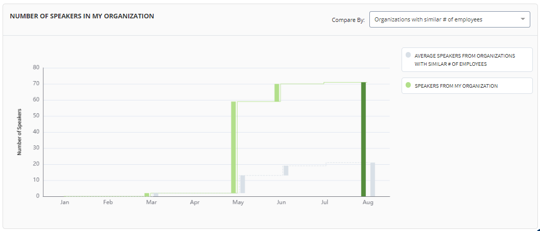
- Bar graph which provides and compares number of speakers from your organization and employees from other organization which has similar number of employees in their organization
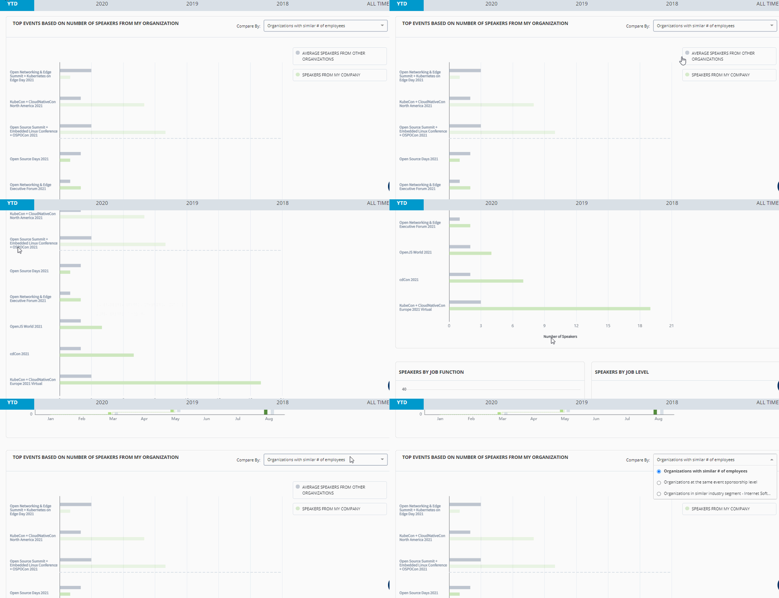
- A horizontal bar graph to compare the top 10 events attended by your speakers with speakers from other organizations
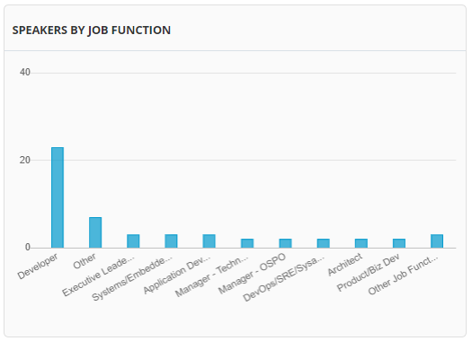
- Bar graph which provides you information on job function of the speakers
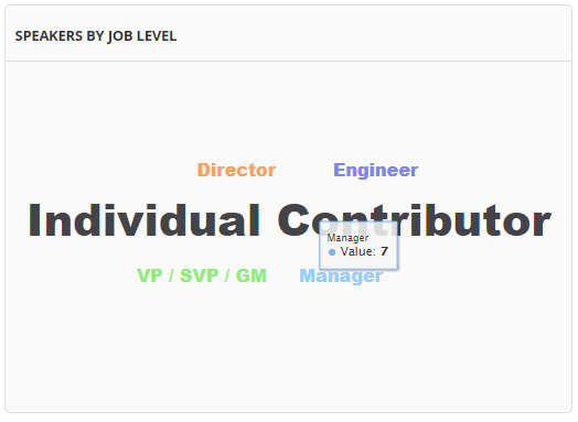
- A word cloud chart that provides information on job level of the speakers
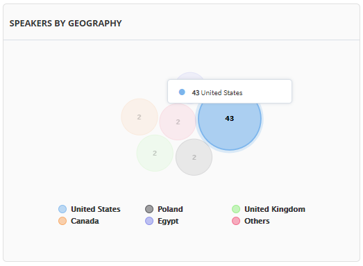
- A bubble chart that provides list of speakers from different regions and countries
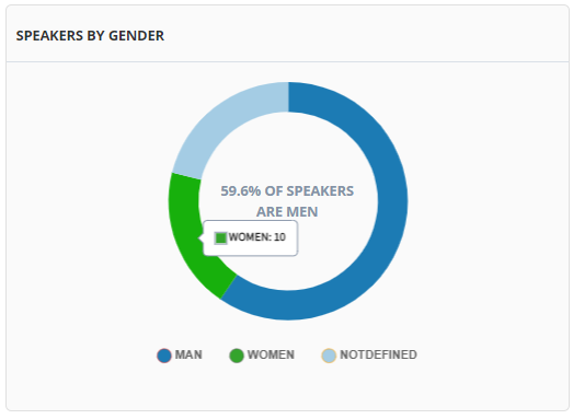
- A donut chart that provides information on gender of your speakers
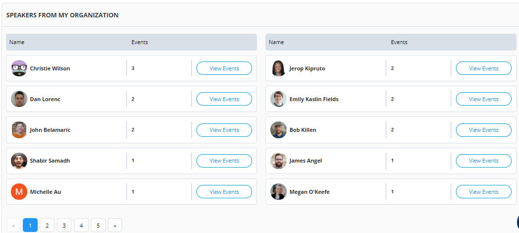
- List of speakers in your organization
The Speaker widget provides you with the total speakers from your organization, total number of events where the speakers provided their presentation and total number of audience participated in the presentation provided by your speakers.
This bar graph provides you the list of speakers who have participated in open source events. This graph provides you the comparison of speakers from your organization and speakers from other organization which has similar number of employees for the open source event for a particular month.
You can also customize the graph based on Organization with similar number of employees, organization at the same event sponsorship level and organization with similar industry segment.
This horizontal bar graph provides you the list of top open source events versus the number of speakers. This graph provides you the comparison of speakers from your organization and speakers from other organization for the open source event.
You can also customize the graph based on Organization with similar number of employees, organization at the same event sponsorship level and organization with similar industry segment.
This bar graph provides you with the information on various job roles of your speakers who have participated in the open source events. This graph shows you various job roles such as developers, architects, project managers, sales and other roles of the speakers. This graph shows also provides you the insight of job role who are more interested in attending the open source events.
This word cloud chart provides with the job level hierarchy in your organization. When you hover over on a particular job level, you can see the number of speakers associated with that job level. Some of the job levels are individual role, contributor role, director and many other roles.
This bubble chart provides you information of speakers of events across different countries. Each bubble represents different location of your organization in different country. When you hover over the mouse, you can see the number of speakers from that country.
This donut chart provides you information on the gender of the speakers. When you hover over the mouse, you can see the gender percentage of the speakers. It shows you the percentage of men, women and members who have not defined their gender.
This table provides you information on the speakers. The list provides details such as speaker name, number of events attended and the events details.
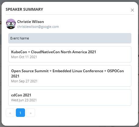
{% hint style="info" %} When you click View Events button, you can see a popup box that provides you details such as speaker name, event name and the date of event. {% endhint %}

