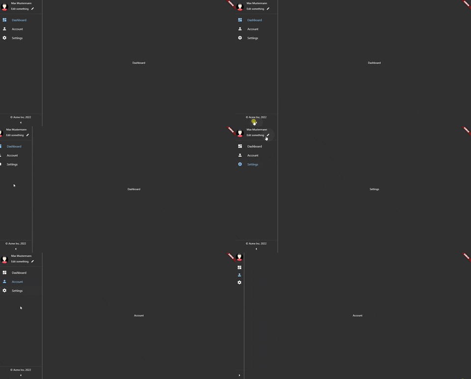
This package provides support to navigate on your app. It was inspired from both the BottomNavigationBar and Drawer. You can think of it as a drawer which is always open. Kind of like a CEO dashboard web application.
NOTE: If you are looking for a Flutter implementation of this navigation approach check out
NavigationRailwhich I recently stumbled upon after publishing this package.
First add the dependency into your pubspec.yaml:
dependencies:
    side_navigation: ^1.0.4
OR Add the dependency via terminal:
flutter pub add side_navigation
When making use of the package:
import 'package:side_navigation/side_navigation.dart';
Right now it is recommended to wrap the SideNavigationBar in a Row and put an Expanded widget around the content to make it expand the rest of the available width. You can also use an AppBar within the Scaffold.
class MainView extends StatefulWidget {
  const MainView({Key? key}) : super(key: key);

  @override
  _MainViewState createState() => _MainViewState();
}

class _MainViewState extends State<MainView> {
  /// Views to display
  List<Widget> views = const [
    Center(
      child: Text('Dashboard'),
    ),
    Center(
      child: Text('Account'),
    ),
    Center(
      child: Text('Settings'),
    ),
  ];

  /// The currently selected index of the bar
  int selectedIndex = 0;

  @override
  Widget build(BuildContext context) {
    return Scaffold(
      /// You can use an AppBar if you want to
      //appBar: AppBar(
      //  title: const Text('App'),
      //),

      // The row is needed to display the current view
      body: Row(
        children: [
          /// Pretty similar to the BottomNavigationBar!
          SideNavigationBar(
            selectedIndex: selectedIndex,
            items: const [
              SideNavigationBarItem(
                icon: Icons.dashboard,
                label: 'Dashboard',
              ),
              SideNavigationBarItem(
                icon: Icons.person,
                label: 'Account',
              ),
              SideNavigationBarItem(
                icon: Icons.settings,
                label: 'Settings',
              ),
            ],
            onTap: (index) {
              setState(() {
                selectedIndex = index;
              });
            },
          ),

          /// Make it take the rest of the available width
          Expanded(
            child: views.elementAt(selectedIndex),
          )
        ],
      ),
    );
  }
}
The usage of a header or footer component are completely optional. However you can either use both of them or just one by itself. This example will provide the usage of both simultaneously.
Example:
class MainView extends StatefulWidget {
  const MainView({Key? key}) : super(key: key);

  @override
  _MainViewState createState() => _MainViewState();
}

class _MainViewState extends State<MainView> {
  List<Widget> views = const [
    Center(
      child: Text('Dashboard'),
    ),
    Center(
      child: Text('Account'),
    ),
    Center(
      child: Text('Settings'),
    ),
  ];
  int selectedIndex = 0;

  @override
  Widget build(BuildContext context) {
    return Scaffold(
      body: Row(
        children: [
          SideNavigationBar(
            header: SideNavigationBarHeader(
              image: CircleAvatar(
                child: Icon(Icons.account_balance),
              ),
              title: Text('Title widget'),
              subtitle: Text('Subtitle widget')
            ),
            footer: SideNavigationBarFooter(
              label: Text('Footer label')
            ),
            selectedIndex: selectedIndex,
            items: const [
              SideNavigationBarItem(
                icon: Icons.dashboard,
                label: 'Dashboard',
              ),
              SideNavigationBarItem(
                icon: Icons.person,
                label: 'Account',
              ),
              SideNavigationBarItem(
                icon: Icons.settings,
                label: 'Settings',
              ),
            ],
            onTap: (index) {
              setState(() {
                selectedIndex = index;
              });
            },
          ),
          Expanded(
            child: views.elementAt(selectedIndex),
          )
        ],
      ),
    );
  }
}
It is possible to style some components or pass configuration data to the bar through the usage of the SideNavigationBarTheme. By default SideNavigationBarTheme.standard() is used.
If you want to create your own theme just use the SideNavigationBarTheme constructor. You can pass a background color to it and even other themes like SideNavigationBarItemTheme and SideNavigationBarTogglerTheme which both also have a standard() factory constructor.
Example of SideNavigationBarTheme:
class MainView extends StatefulWidget {
  const MainView({Key? key}) : super(key: key);

  @override
  _MainViewState createState() => _MainViewState();
}

class _MainViewState extends State<MainView> {
  List<Widget> views = const [
    Center(
      child: Text('Dashboard'),
    ),
    Center(
      child: Text('Account'),
    ),
    Center(
      child: Text('Settings'),
    ),
  ];
  int selectedIndex = 0;

  @override
  Widget build(BuildContext context) {
    return Scaffold(
      body: Row(
        children: [
          SideNavigationBar(
            selectedIndex: selectedIndex,
            items: const [
              SideNavigationBarItem(
                icon: Icons.dashboard,
                label: 'Dashboard',
              ),
              SideNavigationBarItem(
                icon: Icons.person,
                label: 'Account',
              ),
              SideNavigationBarItem(
                icon: Icons.settings,
                label: 'Settings',
              ),
            ],
            onTap: (index) {
              setState(() {
                selectedIndex = index;
              });
            },
            // Change the background color and disabled header/footer dividers
            // Make use of standard() constructor for other themes
            theme: SideNavigationBarTheme(
              backgroundColor: Colors.grey,
              togglerTheme: SideNavigationBarTogglerTheme.standard(),
              itemTheme: SideNavigationBarItemTheme.standard(),
              dividerTheme: SideNavigationBarDividerTheme.standard(),
            ),
          ),
          Expanded(
            child: views.elementAt(selectedIndex),
          )
        ],
      ),
    );
  }
}
Example of SideNavigationBarTheme with SideNavigationBarItemTheme:
IMPORTANT: Note that passing a custom
labelTextStylewith a color won't work because the values will be overridden
... same as in example above
theme: SideNavigationBarTheme(
                      itemTheme: const SideNavigationBarItemTheme(
                        unselectedItemColor: Colors.black,
                        selectedItemColor: Colors.yellow,
                        iconSize: 32.5,
                        labelTextStyle: TextStyle(
                          fontSize: 20,
                          // !! Won't work !! Custom text style colors gets overridden
                          // by unselectedItemColor and selectedItemColor
                          color: Colors.black
                        )
                      ),
                      togglerTheme: SideNavigationBarTogglerTheme.standard(),
                      dividerTheme: SideNavigationBarDividerTheme.standard(),
                      ),
                )
...
If you want to use custom icons for toggling the bar or provide a function to perform tasks after tapping the toggle you can use the SideNavigationBarToggler.
The icons for collapsing the bar default to Icons.arrow_left and Icons.arrow_right.
Example:
class MainView extends StatefulWidget {
  const MainView({Key? key}) : super(key: key);

  @override
  _MainViewState createState() => _MainViewState();
}

class _MainViewState extends State<MainView> {
  List<Widget> views = const [
    Center(
      child: Text('Dashboard'),
    ),
    Center(
      child: Text('Account'),
    ),
    Center(
      child: Text('Settings'),
    ),
  ];
  int selectedIndex = 0;

  @override
  Widget build(BuildContext context) {
    return Scaffold(
      body: Row(
        children: [
          SideNavigationBar(
            selectedIndex: selectedIndex,
            items: const [
              SideNavigationBarItem(
                icon: Icons.dashboard,
                label: 'Dashboard',
              ),
              SideNavigationBarItem(
                icon: Icons.person,
                label: 'Account',
              ),
              SideNavigationBarItem(
                icon: Icons.settings,
                label: 'Settings',
              ),
            ],
            onTap: (index) {
              setState(() {
                selectedIndex = index;
              });
            },
            toggler: SideBarToggler(
                expandIcon: Icons.keyboard_arrow_left,
                shrinkIcon: Icons.keyboard_arrow_right,
                onToggle: () {
                  print('Toggle');
                }),
          ),
          Expanded(
            child: views.elementAt(selectedIndex),
          )
        ],
      ),
    );
  }
}
Desktop:
Personally on Desktop I like it more without the AppBar
On the tablet on the other hand an AppBar blends right in!
For phones, I would recommend only using this type of navigation when the device is in landscape mode. Since the content is displayed very small when in portrait
Currently, the plan is to add support for
- Choosable position of the toggler
- Divide items into sections
If you find any weird behaviour, bugs or errors please let me know. Also, an image or a gif will help a lot if the UI behaves differently.


