Skip to content
New issue

Have a question about this project? Sign up for a free GitHub account to open an issue and contact its maintainers and the community.

By clicking “Sign up for GitHub”, you agree to our terms of service and privacy statement. We’ll occasionally send you account related emails.

Already on GitHub? Sign in to your account

How can I visualize the graph? #4

Open
enumag opened this issue Dec 19, 2017 · 3 comments
Open

How can I visualize the graph? #4

enumag opened this issue Dec 19, 2017 · 3 comments

Comments

@enumag
Copy link
Member

enumag commented Dec 19, 2017

@codeliner I saw your tweet about this tool and wanted to try it. I successfully generated a prooph_message_flow.json file for my project. Now I would like to turn it into the image like the one you had in your tweet. Can you give me some tips how to do it with arangodb? I saw your docker command in the tweet but I was unable to find the bin/arango_import_graph.php file you used.

@codeliner
Copy link
Member

This part of the tool is not ready yet. The tweet was "just" a sneak preview ;)

I used the special output formatter JsonArangoGraphNodes

Run the analyzer with the option -f JsonArangoGraphNodes The ouput formatter prepares arangodb collection. The script in the tweet was just a few LoC to import the collections into arangoDB. Arango UI then offers a Graph view, but it is not that good for our use case.

Hence, I'm working on an own UI, but no documentation or anything available yet. You would need to try it yourself. I cannot support atm, because this is all in the prototype phase and things will change:

Anyway, there is another output formatter JsonCytoscapeElements

-f JsonCytoscapeElements

You have to install and build the event-store-mgmt-ui: https://github.com/prooph/event-store-mgmt-ui
follow instructions in the README.
Again: this package is under heavy development. Don't expect a ready to use UI or something. Things can be broken. In fact, the entire ES mgmt part is not available yet.
BUT in the menu you can find the message-flow analyzer. Open the drawing board and then just drag and drop the file produced by the message flow analyzer (using the correct output formatter!) on the drawing area.
The graph will look ugly (positioning the elements is one of the bigger problems I'm facing atm), but you can move elements around and even save and export the graph.

If you get it to work and you can share the graph it would be nice if you provide me with an export so that I can import it on my machine and check your work ;)

@enumag
Copy link
Member Author

enumag commented Jan 3, 2018

In the end I made a simple visualization using vis.js network.

The one problem I have right now is that the JSON is missing information about which method on the aggregate root is called by which command handler. It's visible even in your example image - for example it's not clear that AddReminderToTodoHandler calls Todo::addReminder(). Could this be added somehow?

@codeliner
Copy link
Member

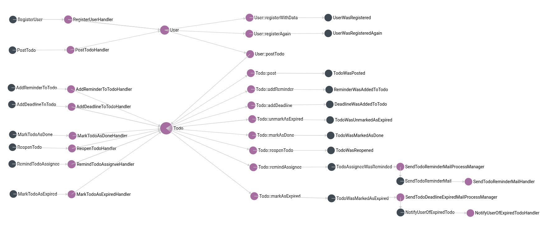
This information is currently only available when using the JsonCytoscapeElements output formatter. It is collected here

You could use the result of that formatter. It includes nodes and edges information that you can use as basis for other graph visualization tools as-well.

Sign up for free to join this conversation on GitHub. Already have an account? Sign in to comment
Labels
None yet
Projects
None yet
Development

No branches or pull requests

2 participants