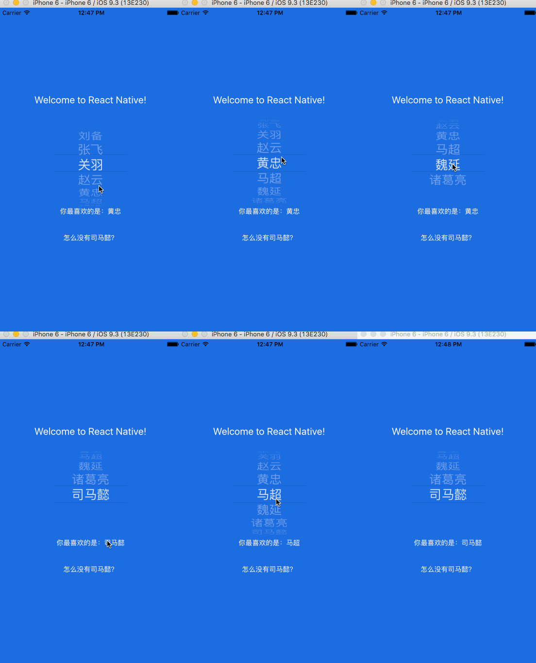
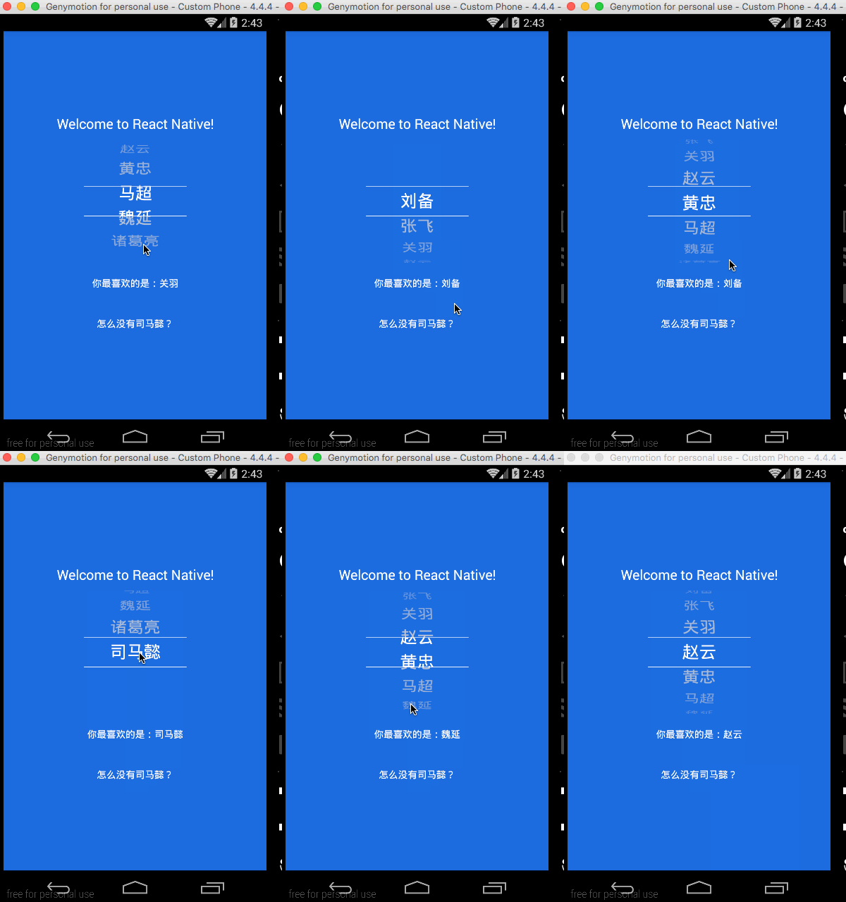
This is a fork of a fork. The original code is from lesliesam. That project was abandoned and did not allow for the color of the separators to be changed. m3rlin94 created a fork to allow that to be changed, but did not add the package to NPM as far as I can tell. So I created this fork to allow a package manager to manage the code base.
See below for example on how to use the added styles.
When using the colors, they must be a 6 digit hex value. Short hand colors (#333, red, etc.) are not supported
Cross platform Picker component based on React-native.
Since picker is originally supported by ios while Android only supports a ugly Spinner component. If you want to have the same user behaviour, you can use this.
The android component is based on https://github.com/AigeStudio/WheelPicker which runs super fast and smoothly. It also supports curved effect which make it exactly the same looking and feel as the ios picker.


Run command
For apps using RN 0.40 or higher, please run
npm i react-native-wheel-picker-with-color --save
Add in settings.gradle
include ':react-native-wheel-picker' project(':react-native-wheel-picker').projectDir = new File(settingsDir, '../node_modules/react-native-wheel-picker-with-color/android')
Add in app/build.gradle
compile project(':react-native-wheel-picker')
Modify MainApplication
import com.zyu.ReactNativeWheelPickerPackage;
......

protected List<ReactPackage> getPackages() {
    return Arrays.<ReactPackage>asList(
        new MainReactPackage(), new ReactNativeWheelPickerPackage()
    );
}
## Example code
import React, { Component } from 'react'; import { Platform, StyleSheet, Text, View, } from 'react-native';
import Picker from 'react-native-wheel-picker-with-color' var PickerItem = Picker.Item;
export default class App extends Component<{}> {
constructor(props) {
	super(props);
	this.state = {
		selectedItem : 2,
		itemList: ['刘备', '张飞', '关羽', '赵云', '黄忠', '马超', '魏延', '诸葛亮']
	};
}

onPickerSelect (index) {
	this.setState({
		selectedItem: index,
	})
}

onAddItem = () => {
	var name = '司马懿'
	if (this.state.itemList.indexOf(name) == -1) {
		this.state.itemList.push(name)
	}
	this.setState({
		selectedItem: this.state.itemList.indexOf(name),
	})
}

render () {
	return (
		<View style={styles.container}>
			<Text style={styles.welcome}>
				Welcome to React Native!
			</Text>

			<Picker style={{width: 150, height: 180}}
			        lineColor="#000000" //to set top and bottom line color (Without gradients)
			        lineGradientColorFrom="#008000" //to set top and bottom starting gradient line color
			        lineGradientColorTo="#FF5733" //to set top and bottom ending gradient line color
				selectedValue={this.state.selectedItem}
				itemStyle={{color:"white", fontSize:26}}
				onValueChange={(index) => this.onPickerSelect(index)}>
					{this.state.itemList.map((value, i) => (
						<PickerItem label={value} value={i} key={"money"+value}/>
					))}
			</Picker>
			<Text style={{margin: 20, color: '#ffffff'}}>
				你最喜欢的是:{this.state.itemList[this.state.selectedItem]}
			</Text>

			<Text style={{margin: 20, color: '#ffffff'}}
					onPress={this.onAddItem}>
		怎么没有司马懿?
			</Text>
		</View>
	);
}
}
const styles = StyleSheet.create({ container: { flex: 1, justifyContent: 'center', alignItems: 'center', backgroundColor: '#1962dd', }, welcome: { fontSize: 20, textAlign: 'center', margin: 10, color: '#ffffff', }, instructions: { textAlign: 'center', color: '#333333', marginBottom: 5, }, });

