A clean toolkit for onboarding (iOS & macOS)
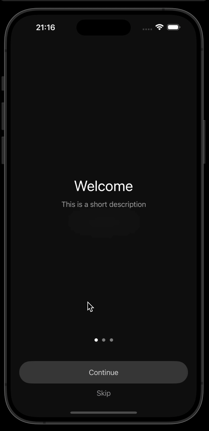
- OnboardKit is a comprehensive SwiftUI library designed to simplify the creation of onboarding experiences for iOS and macOS applications.
- Supply your own page models with title, description and buttons.
- Customize the sheet content with your own views. Sheets are prompted via button actions. Button actions can also trigger other actions you wish to add.
- 🌙 Dark / Light Mode Support
- 🌫️ Subdued Translucent Background (app as background)
- 📋 Prompt Sheets via Button Actions (from bottom for iOS, from top for macOS)
- ➕ Add Custom Steps via Sheets (great for additional onboarding customizations)
- 🧩 Bring Your Own (BYO) Page Model (easily create model via array of tuples)
- 📱 Multiplatform Support (iOS and macOS - iPad / iPhone / Mac)
◀️ ▶️ Left / Right Chevron Buttons (macOS expected UX)- 🤚 Panning Support for macOS (navigate left / right)
OnboardContainer: ZStack wrapper w/ app + onboard-coverOnboardCover: VStack w/ contet + bottom-nav-barOnboardPage: Title, description, action-buttons. And sheet bindingPageContainer: The swipe-caruselNavView: Continue-button, Skip-button and dotsControlOverlayHas Previous and next arrow buttons (macOS only)OnboardModel: Title, description and action
Here is a basic example of how to set up OnboardKit in your SwiftUI application:
import SwiftUI
import OnboardKit

@main
struct MyAppIOSApp: App {
   var body: some Scene {
      WindowGroup {
         ContentView()
      }
   }
}
struct ContentView: View {
   @State var needsOnboarding: Bool = true
   var body: some View {
      OnboardContainer(needsOnboarding: $needsOnboarding) { (_ needsOnboarding: Binding<Bool>) in
         OnboardView(
            pageModels: OnboardModel.dummyModels, // point to your own onboarding models here
            onComplete: {
               needsOnboarding.wrappedValue = false
            }
         )
      } background: {
         ZStack {
            Rectangle() // this is where the app main view goes
               .fill(Color.init(light: Color.lightGray.lighter(amount: 0.8), dark: Color.darkGray.darker(amount: 0.8))) // light or dark mode
            Text("Your app goes here")
         }
         .frame(maxWidth: .infinity, maxHeight: .infinity)
         .edgesIgnoringSafeArea(.all)
      }
   }
}To integrate OnboardKit into your Xcode project using Swift Package Manager, add the following as a dependency to your Package.swift:
.package(url: "https://github.com/sentryco/OnboardKit", branch: "main")OnboardKit utilizes these dependencies:
- Light and dark mode: HybridColor
- Page control for iOS: PageControl
- Page controller for macOS: PageControllerView
- Blur view support: BlurView
OnboardKit seamlessly supports both iOS and macOS platforms, ensuring a consistent onboarding experience across devices. Platform-specific features include:
- iOS
- Swipe navigation with
TabView - Page control indicators
- Sheets presented from the bottom
- Swipe navigation with
- macOS
- Left/right chevron buttons for navigation
- Panning support (navigate left/right)
- Sheets presented from the top
OnboardKit is built around a simple yet powerful model system. By supplying your own OnboardModel instances, each containing a title, description, and optional actions, you can quickly assemble a customized onboarding experience.
This approach allows you to:
- Easily define the content of each onboarding page.
- Attach custom actions to buttons, including presenting sheets or performing other tasks.
- Maintain a clean separation between your onboarding logic and UI components.
Here's an example of defining custom page models:
let pageModels: [OnboardModel] = [
   OnboardModel(
      title: "Welcome",
      description: "Explore the amazing features of our app.",
      actions: []
   ),
   OnboardModel(
      title: "Stay Informed",
      description: "Enable notifications to stay updated.",
      actions: [
            (
               buttonTitle: "Enable Notifications",
               action: { observableSheet in
                  // Handle enabling notifications
               }
            )
      ]
   ),
   OnboardModel(
      title: "Get Started",
      description: "Let's start your journey!",
      actions: []
   )
]When integrating OnboardKit, ensure that your main app view uses:
.frame(maxWidth: .infinity, maxHeight: .infinity)
.edgesIgnoringSafeArea(.all)
This ensures that the onboarding views cover the entire screen and layouts are handled correctly across different devices and orientations.
- https://sarunw.com/posts/how-to-create-neomorphism-design-in-swiftui/
- https://github.com/ciaranrobrien/SwiftUIPageView
- https://sarunw.com/posts/uikit-in-swiftui/
- https://github.com/exyte/ConcentricOnboarding
- fancy custom advance onboarding: https://betterprogramming.pub/scroll-programatically-with-swiftui-scrollview-f080fd58f843
- https://github.com/fredyshox/PageView
- https://stackoverflow.com/questions/58388071/how-can-i-implement-pageview-in-swiftui
- Good tutorial for onboarding: https://medium.com/@sharma17krups/onboarding-view-with-swiftui-b26096049be3
- https://github.com/Krupanshu-Sharma/OnBoardingViewSwiftUI
- macos: https://github.com/ishaanbedi/Voyager/tree/main/Swift%20Post/Views/OnboardingViews
- https://eon.codes/blog/2023/03/11/onboarding-best-practice/
- Clean up code ✅
- Add gif for macOS / iPad
- Add modal sheet example ✅
- Enable isTest in the scope of this package ✅
- Add high level doc regarding the simplistic approch with models that can have btns, title, decription, and popover sheet, and how this ultimatly makes making multipleplatform onbiarding a breeze, yet makes it possible to build powerful and complex onboarding experiences, while leaving the nitty gritty to this kit
- Add note regarding implemnting a lockable view with onboardview. How the structure will look etc, and link to the repo etc?
- Add a const struct that can be inject when initiating, that has variouse custom sizes etc
- Make some sort of style struct we can inject on init of onboardkit? ViewModifiers can be used with param drilliing etc
- Add access-id struct as well?
- Add demo xcodproj file like we do with SplitViewKit? 👈 instead of having the dummy code in the preview etc
- Add PreviewContainer class 👈
- Bump spm package to 6.0 and iOS 18 and macOS 15 etc 👈
- Add note in readme about importance of using frame width max infinity and edgeIgnores... etc
- Add emojies to the features list. Use gpt
- Figure out how to offset dots for iOS ?
- Add onboardstyle:
 // Define a Style struct
public struct OnboardStyle {
      public var titleFont: Font
      public var descriptionFont: Font
      public var titleColor: Color
      public var descriptionColor: Color
      public var backgroundColor: Color
      // Add other style properties as needed
}- Enhance Flexibility with Custom Views Allow users to supply custom views for onboarding pages.
public struct OnboardPage: View {
   let content: AnyView?

   public init(content: AnyView?) {
      self.content = content
   }

   public var body: some View {
      if let content = content {
            content
      } else {
            // Fallback to default implementation
      }
   }
}

// Usage
OnboardPage(content: AnyView(CustomOnboardingStep()))