Secure input UI (macOS / iOS)
1. SecureInputView
2. PasswordTextField
3. SecTextContainer
4. SecureTextView
This repository provides a collection of secure text input UI components, each with its unique features and trade-offs. They are designed to serve various purposes in applications that prioritize secure data handling. For more detailed information and the rationale behind each component, please refer to the code comments within the UI components.
SecureInputView: obfuscation-toggle, SecureTextPasswordTextField: obfuscation-toggle, SecureText and restrictor-callbackSecTextContainer: obfuscation-toggle, attribute and multiline (Not using SecureText and not editable)SecureTextView: obfuscation-toggle, multiline (Not using SecureText)
Add this to XCode or SPM:
.package(url: "https://github.com/sentryco/SecureInput", branch: "main")import SecureInput
struct ContentView: View {
@State private var text: String = ""
var body: some View {
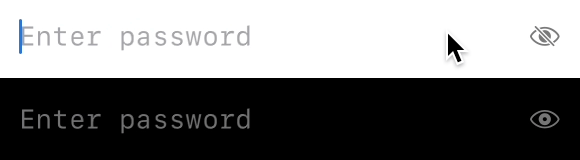
SecureInputView(placeholder: "Enter password", text: $text)
.padding()
}
}import SecureInput
struct ContentView: View {
@State private var password: String = ""
var body: some View {
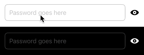
PasswordTextField(
isPasswordVisible: false,
hint: "Password",
text: $password
)
.padding()
}
}import SecureInput
struct ContentView: View {
@State private var secureText: String = "Secure Content"
var body: some View {
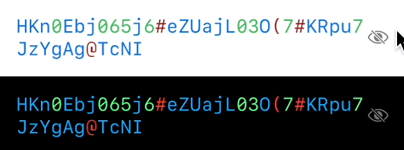
SecTextContainer(
isSecured: true,
str: $secureText,
placeholderText: "Secure Text"
)
.padding()
}
}import SecureInput
struct ContentView: View {
@State private var visibleInput: String = ""
var body: some View {
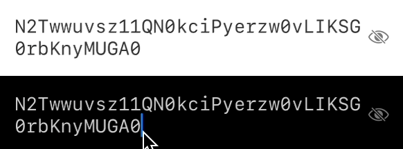
SecureTextView(
isSecured: true,
visibleInput: $visibleInput,
placeholderText: "Enter secure text"
)
.padding()
}
}-
Styling Components: Add your own style to components by creating new
TextFieldStyles and applying them to the view structs. This way, your custom style overrides the internal styles.struct CustomTextFieldStyle: TextFieldStyle { func _body(configuration: TextField<Self._Label>) -> some View { configuration .padding() .background(Color.gray.opacity(0.2)) .cornerRadius(8) } } TextField("Placeholder", text: $text) .textFieldStyle(CustomTextFieldStyle())
- Add your own style to components by making new TextFieldStyles and apply them to the view struct components. This way the new style overrides the internal TextFieldStyles
- Add Attributed TextField that is editable
- Only use the MockGen dep for the testing scope?
- Make more high-level styling. use ViewBuilder + style struct with param drilling etc. Or use environment variable etc
- Remove MockGen as dep. Use private rand methods, use copilot etc
- Add debug flag.
public var isSecureInputDebug: Bool = false - Add: AttributedTextField
    // You can create a custom UIViewRepresentable for UITextView on iOS or NSTextView on macOS to handle attributed text input.
   import SwiftUI

   struct AttributedTextField: UIViewRepresentable {
       @Binding var attributedText: NSAttributedString
       var placeholder: String

       func makeUIView(context: Context) -> UITextView {
           let textView = UITextView()
           textView.delegate = context.coordinator
           textView.isScrollEnabled = false
           textView.backgroundColor = .clear
           textView.attributedText = attributedText
           textView.font = UIFont.systemFont(ofSize: 16)
           return textView
       }

       func updateUIView(_ uiView: UITextView, context: Context) {
           if uiView.attributedText != attributedText {
               uiView.attributedText = attributedText
           }
           if uiView.text.isEmpty {
               uiView.text = placeholder
               uiView.textColor = UIColor.lightGray
           } else if uiView.textColor == UIColor.lightGray && uiView.text != placeholder {
               uiView.textColor = UIColor.label
           }
       }

       func makeCoordinator() -> Coordinator {
           Coordinator(self)
       }

       class Coordinator: NSObject, UITextViewDelegate {
           var parent: AttributedTextField

           init(_ parent: AttributedTextField) {
               self.parent = parent
           }

           func textViewDidChange(_ textView: UITextView) {
               parent.attributedText = textView.attributedText
           }

           func textViewDidBeginEditing(_ textView: UITextView) {
               if textView.textColor == UIColor.lightGray {
                   textView.text = nil
                   textView.textColor = UIColor.label
               }
           }

           func textViewDidEndEditing(_ textView: UITextView) {
               if textView.text.isEmpty {
                   textView.text = parent.placeholder
                   textView.textColor = UIColor.lightGray
               }
           }
       }
   }
// for macos
import SwiftUI
struct AttributedTextField: NSViewRepresentable {
@Binding var attributedText: NSAttributedString
var placeholder: String
func makeNSView(context: Context) -> NSTextView {
let textView = NSTextView()
textView.delegate = context.coordinator
textView.isEditable = true
textView.isRichText = true
textView.backgroundColor = .clear
textView.textStorage?.setAttributedString(attributedText)
textView.font = NSFont.systemFont(ofSize: 16)
return textView
}
func updateNSView(_ nsView: NSTextView, context: Context) {
if nsView.attributedString() != attributedText {
nsView.textStorage?.setAttributedString(attributedText)
}
if nsView.string.isEmpty {
nsView.string = placeholder
nsView.textColor = NSColor.lightGray
} else if nsView.textColor == NSColor.lightGray && nsView.string != placeholder {
nsView.textColor = NSColor.labelColor
}
}
func makeCoordinator() -> Coordinator {
Coordinator(self)
}
class Coordinator: NSObject, NSTextViewDelegate {
var parent: AttributedTextField
init(_ parent: AttributedTextField) {
self.parent = parent
}
func textDidChange(_ notification: Notification) {
if let textView = notification.object as? NSTextView {
parent.attributedText = textView.attributedString()
}
}
func textDidBeginEditing(_ notification: Notification) {
if let textView = notification.object as? NSTextView {
if textView.textColor == NSColor.lightGray {
textView.string = ""
textView.textColor = NSColor.labelColor
}
}
}
func textDidEndEditing(_ notification: Notification) {
if let textView = notification.object as? NSTextView {
if textView.string.isEmpty {
textView.string = parent.placeholder
textView.textColor = NSColor.lightGray
}
}
}
}
}// You can integrate AttributedTextField into your SwiftUI views as follows:
struct ContentView: View {
@State private var attributedText = NSAttributedString(string: "")
var body: some View {
AttributedTextField(attributedText: $attributedText, placeholder: "Enter rich text...")
.padding()
}
}- Make centralised consts:
import SwiftUI

enum Constants {
    enum Icons {
        static let eye = "eye"
        static let eyeSlash = "eye.slash"
        // Add more icons as needed
    }

    enum Colors {
        static let placeholder = Color.gray.opacity(0.8)
        static let textPrimary = Color.primary
        // Add more colors as needed
    }

    enum Spacing {
        static let standardPadding: CGFloat = 16
        static let tightPadding: CGFloat = 4
        // Add more spacing constants as needed
    }
}