5. Art Bible
- Sprite Library
- Art Style
- Character/Building Art
- Level of Detail
- Camera
- Color Palette
- Enviroment / Atmosphere
- UI
- Technical Guidelines
Here you can find the sprites we are going to use in different documents.
As our game is an expansion of Command and Conquer: Red Alert 2, the main art style remains the same. To make the game realistic and visually easy to recognize, there is going to be two teams with different artistic features, but same fuctionalities. Allied vs soviet. In this way the player with one quick look at the game can easily recognize both teams and differences between them. Also, everything needs to be intuitive, so the player knows what a certain element will do just by looking at it.
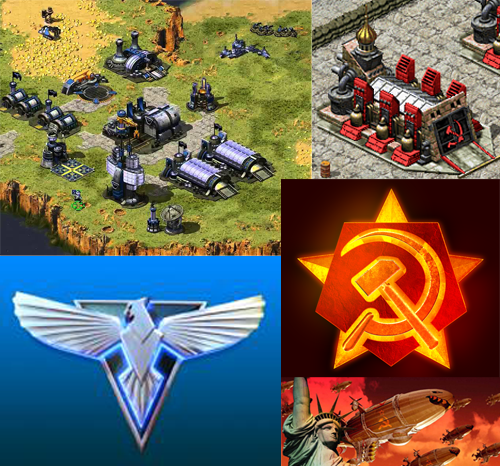
Our main goal is to easily differentiate one player troops, buildings and abilities from the other one. We could just change the colour of the sprite, but as we want to remain the core of the C&C, the main buildings are different from each other, not only by the architecture itself but also adding colour to visually highlight it.
Here an example. On the right an Allied townhall and on the left a Soviet one.


There will also be visual level on the screen. The health/damage/abilities of building and troops can be updated. In order to facilitate the player, the sprites will change or a new sprite will be added in the screen. For buildings, the sprite will change, as this townhall:
![]()
However, sprites of troops will not change. Instead an icon will apear next to them when the troop increases a level (military rank) or is immune by a special ability (shield).


Some elements require more visual attention than others, that's why we need to distinguish them somehow. One of the most important things in the game is the Gold Bar, so to give importance over other elements we could use a really light and saturated yellow, while the rest of the elements are more unsaturaded or darker. The same will happen with buildings and troops Health Bar.
In order of importance for player visual attention will be:
- Alerts (to do that we could use some flashing and blinking animations).
- Gold and health bars.
- Buildings.
- Terrain.
The camera of the game will be situated at an isometric view of the world. It will be static, as two players will be playing in the same screen and also to have a general overview of each base and do not miss any movement or action.
In the screen the both players will see:
- The map they are playing.
- The own UI and the enemy one.
- Different zones with different functionalities.
Here an sketch of the visual look of the game:

The sprites we will take are the ones that belong to Command and Conquer: Red Alert 2. Even though, we will modify some sprites to make the game faster and more visually attractive.
The terrain tiles are 60x30.

Buildings and troops have different sizes depending of each one, so the game is not realistically scaled. Buidings are scaled smaller in relation with troops or troops are scaled bigger in relation with buildings. This is done like this so the player can visualize buildings and troops. If the scale were realistic troops will be so small or building so big.

As our space in the game is small for the type of game we want to make, this scale goes really well.
There are two differentiated color palettes. One for the Soviet team and one for the Allied. These are the following in the order listed.


![]()
These color palettes alow us to clearly visualize one team from the other. Red gamma of colors represent energy, war, danger, strength, power as well as the communism and soviet. On the other hand, blue represents trust, loyalty, wisdom, confidence, intelligence and it is usually determined as Allied team. Historically speaking, these colors represent what they will represent on our game, which makes it easier to visualize for the player and also intuitive.
The darker is the area the less the player will use it and the lighter the more. The top-left and bottom-left triangles are very light as the UI is placed there and the player will be constantly using it. In the middle of the camera, even though players will not be able to use that area, it is visually important as fights will be released there, that's why it is not totally black.

As we think to implement more than one map to give variety to the players, in Command and Conquer: Red Alert 2, there are four distinguished enviroments. The atmosphere of the map will be affected with one enviroment or another and also the player experiece. For example, if the map is based on the city enviroment, troops will be able to move faster, instead on the snow enviroment, they will move slower.
The four main enviroments are the following:
- Green field.
- Snow.
- Urban.
- Coast.

Explained in the UI Document
We will strucuture the art (sprites) in one folder. Inside these ones, there will be subfolders for allieds and soviets, and inside these troops, buildings, etc. All the material inside the folders will be saved and exported as png as it accomplish our requirements in the implementation of the game.
- XCC Mixer. We use the last version of XCC Mixer at the moment (1.47), in order to extract the sprites from the game.

-
 Then we edit the sprites on Adobe Photoshop.