A beautiful weather data shows you what it feels like in different places all over the world for a whole year.
Choose climate station on the map and see the weather shot. It consists of 365 bars laying on the temperature scale. Bar base (closer to center) - is lowest day temperature, and top - highest. The color of bar shows the mean.
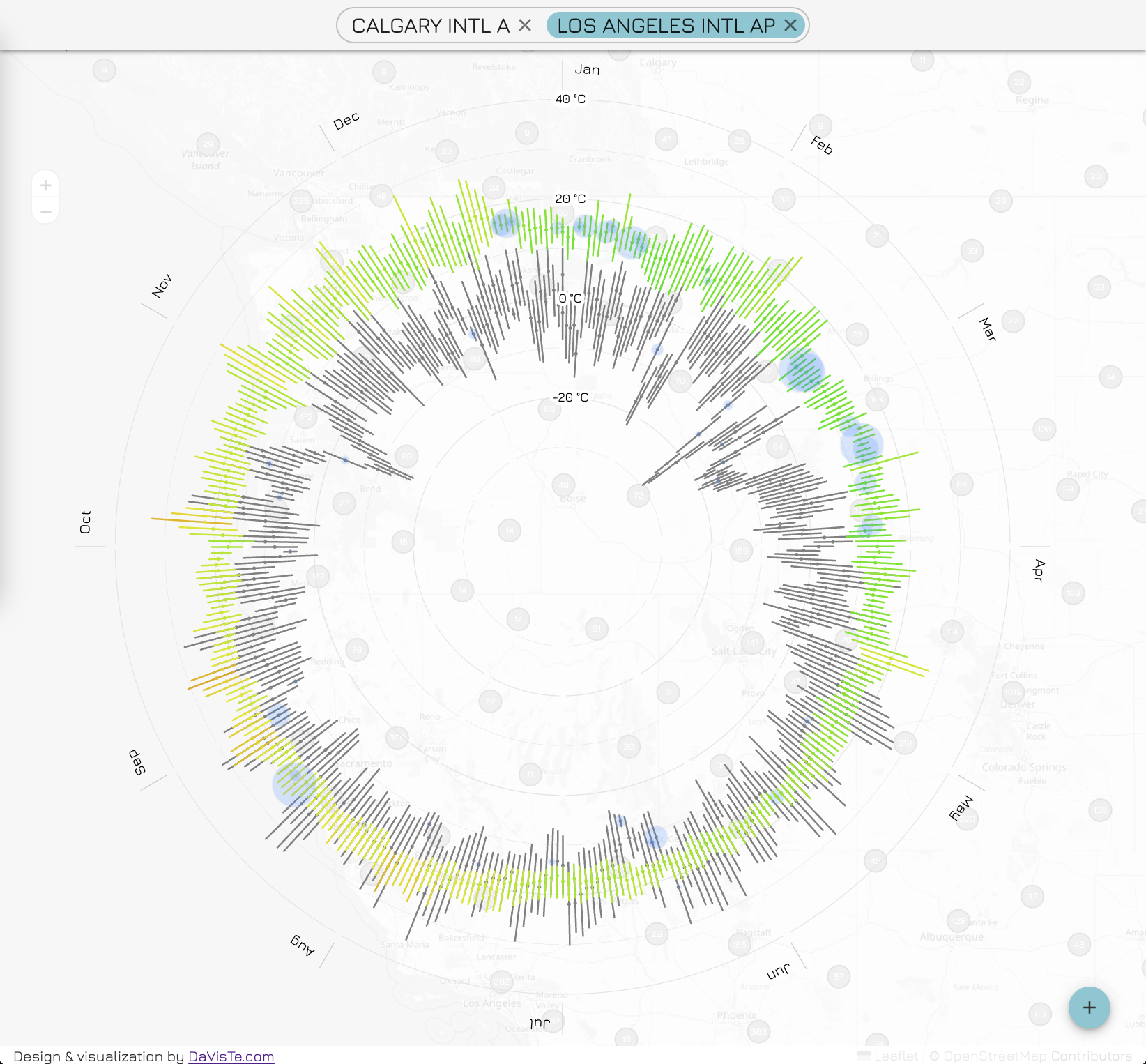
- weather visualization
- Temperature
- Bar for min, max
- Dot for daily average
- Color coding for average
- circle for precipitation
- Temperature
- prepared data from NOAA
- city selection on the map
- visualization transformation on city selection
- Comparison visualization
- clustering of points on the map
- optimized for mobile
- Wind/Air stagnation
- speed: peak, avg
- direction (avg)
- Humidity
- Sun
- Insolation
- daylight/night time
- sunshine/cloudy
- default city should be defined by detecting browser geo-location
- search by geocode
- responsive
- Realtime visualization on daily data from NOAA
-
Calibrate temperature colors
-
show about info (year)
-
optimize chart size for various screens
-
limit map pan on world view (smallest zoom)