Generic reusable plugin that will show a chart in column based on properties file.
The plugin reads properties file in your archive, specified by glob, and use one value, deffined by key, to draw a chart for both project and view. The plugin was orriginally designed to show results of benchmarks, but canbe missused for anything key-number what destire chart. Eg total and failde tests summaries. The graph is scaled, so you will never miss smallest change.
- Properties file
- Project summary
- View summary
- Blacklist and Whitelist
- Project Settings
- View Settings
- Limitations
- Future work
To make plugin work, you need a properties file with results form your job, archived. The properties file is eg our:
lastSuccessfulBuild/artifact/jbb-report/result/specjbb2015-C-20180717-00001/report-00001/specjbb2015-C-20180717-00001.raw
# garbage
jbb2015.result.metric.max-jOPS = 22523
jbb2015.result.metric.critical-jOPS = 8902
jbb2015.result.SLA-10000-jOPS = 4774
jbb2015.result.SLA-25000-jOPS = 7442
jbb2015.result.SLA-50000-jOPS = 9643
jbb2015.result.SLA-75000-jOPS = 11833
jbb2015.result.SLA-100000-jOPS = 13791
other garbage
The parser is quite forgiving, and will skip garabge. Supports both : and = delimiters.
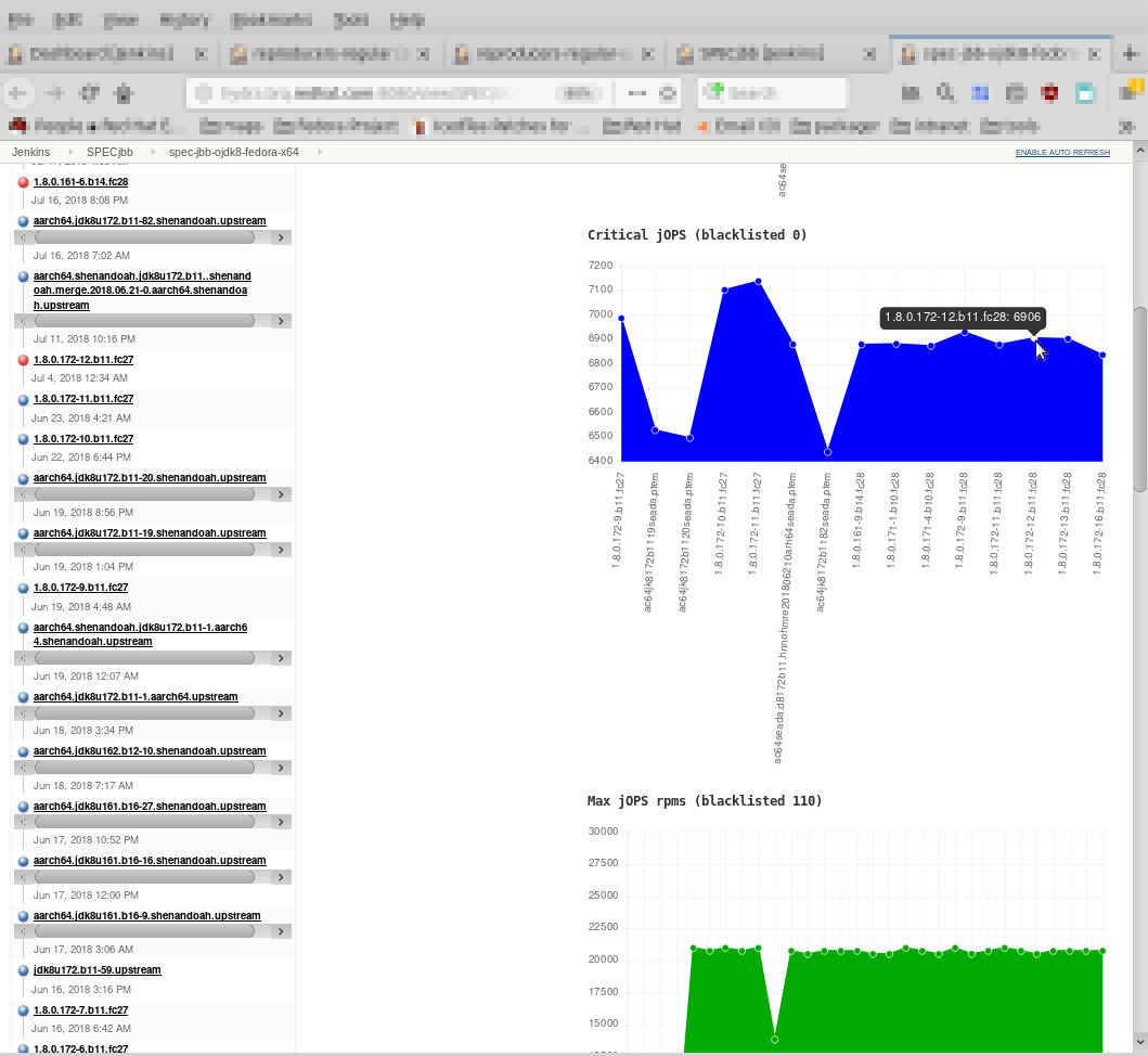
Hugest graphs are shown in project sumamry. You can have as much graphs as you wish, and have detailed tooltip:
 Comparing individual jobs was never more simple:)
You can include the graphs to the view:
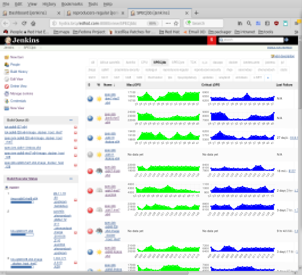 Comparing individual projects was never more simple:)
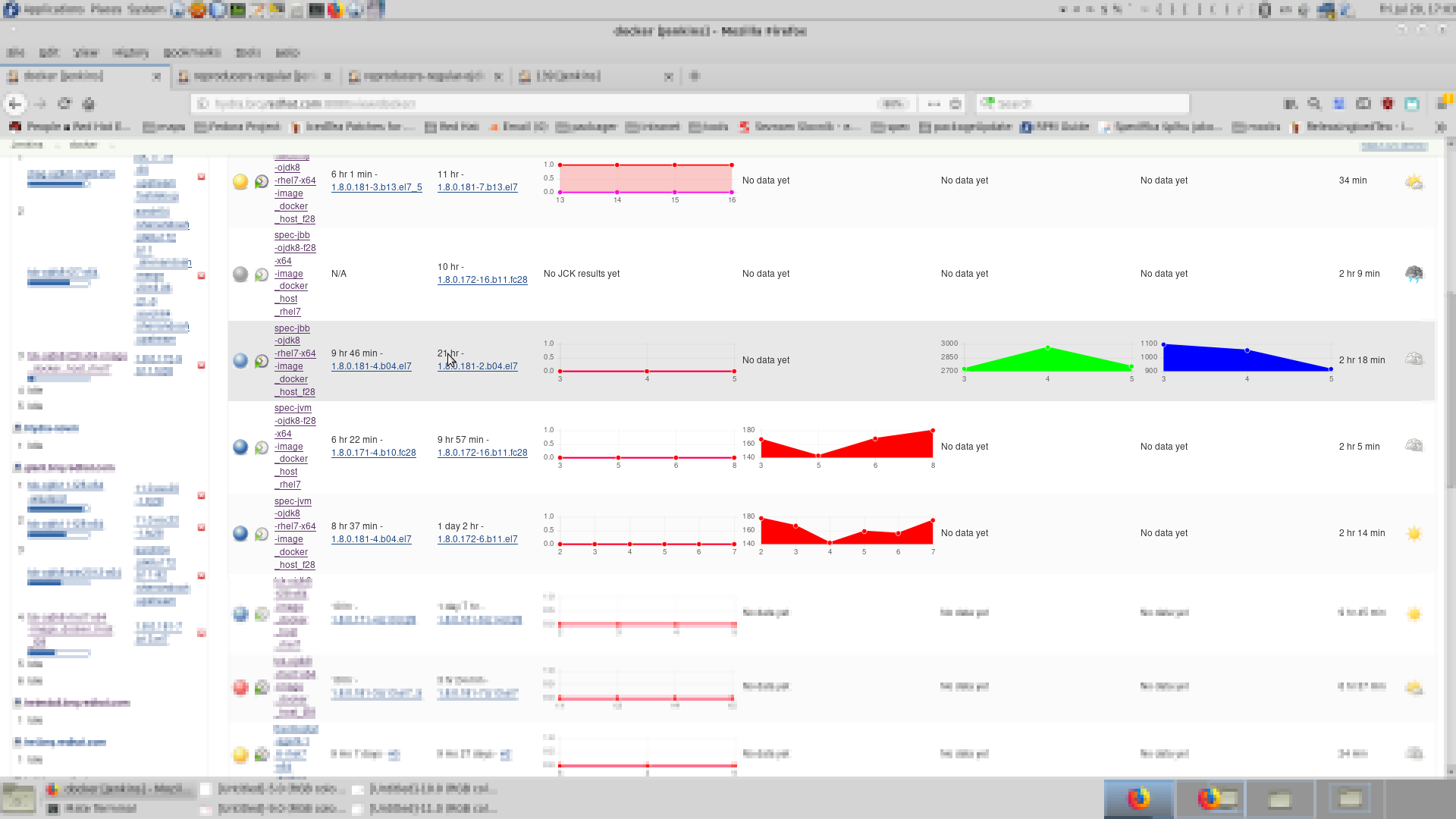
You can of course mix it with other propertis or other plugins
The results in view are sortable - they are sort by last valid result shown in chart.
Comparing individual projects was never ever more simple:)
you could noted, that the graphs are scalled. Ifyou have run, which escapes the normality, the scale get corrupeted, and youc an easily miss regression. To fix this, you have balcklist (and whitelist). This is list of regexes, whic filters (first) out and (second) in the (un)desired builds. It works both with custom_built_name and #build_number. Empty blacklist/whitelist means it is not used at all.
Project settings and view settings are separate - with both pros and cons!
 Most important is Glob pattern for the report file to parse, which lets you specify not absolute (glob) path to your properties file and of course Key to look for in the report file which tetls chart what value to render. Chart name and color are cosmetic, blacklist and whitelist were already described. Number of data points to show is how many successful builds (counted from end) should be displayed. If you are in doubts, each suspicious field have help.
Project settings and view settings are separate - with both pros and cons!
 You can see that the settings of view are same - thus duplicated with all its pros and cons...
The limitations flows from double settings and from fact that each chart can show only only one value. The non-shared blacklist/whitelist is a negative which we are working on to improve. One line only is considered as - due toscalled graph - definitely positive.
Number of points before and after chosen point using whitelist. For example if you have whitelisted 3 and 4 and range is 2 graph will show points 1 2 3 4 5 6 if no one is failed. If some has failed for example 2 graph will show 1 3 4 5 6. That means failed builds are counted as passed. (TODO FIXME)
 Up is without whitelisted and range. Down is with whitelist (1.8.0.172.*) and range (2).
 Up is withis with whitelist (1.8.0.172.*) and range (2). Down is with whitelist (1.8.0.172.*) and without range.

We wish to improve whitelist/balcklist feature, so it can be used to generate wievs comparing selected runs across jobs with some kind of neigbrhood
This plugin depends on https://github.com/judovana/jenkins-chartjs-plugin