Manhattan plots
 Figure 1 - Manhattan plots
User can view GWAS results using the interactive Manhattan plots (see Figure 1).
The Manhattan plots are basically scattercharts for displaying the p-values of genetic markers. Each marker in the scatterplot represents a Single Nucleotide Polymorphism (SNP). Each Manhattan plot shows the SNPs of one chromosomes. The Y-axis displays the score and the x-axis the genomic position.
The higher the score, the more significant the association. A horizontal dotted line represents the multiple testing threhsold and assists the user to distinguish between significant and insignificant associations.
The shape of the marker in the scatterplot tells you something about the annotation:
- Rectangle: Synonymous SNPs
- Triangle: Non-Synonymous SNPs
- Circle: Unknown annotation
Moving the mouse over a SNP will display some statistics such as minor allele frequency (MAF), minor allele count (MAC) and annotation, as well as position and score in the upper left corner.
The user can interct with the Manhattan plots in different ways:
The user can zoom into a specific region to see the genes underneath a specific region. This can be done by using a click hold and drag gestures with the mouse (see figure 2):
click + hold -> drag + release
Once the user is zoomed in a small enough region, a basic gene annotation Track will be displayed underneath the Manhattan plot. The gene annotation track shows the genes in that region as simple arrows. Moving the mouse over a SNP in the Manhattan plot will display vertical line in the annotation track. If the SNP is on top of a gene it will highlight the corresponding gene.
Moving the mouser over a gene will display a popup with additional information about the gene. Clicking on the gene will open the TAIR information page for that gene.
If the user zooms further down, a more detailed gene annotation track containing single gene features will be displayed. This time the vertical line will not only highlight the corresponding gene but also the gene feature.
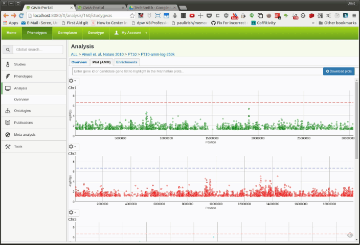
Figure 2 - Zooming interactions
In the top left corner there is a gear icon. Clicking on that will open a settings menu with 4 different tabs (see figure 3)
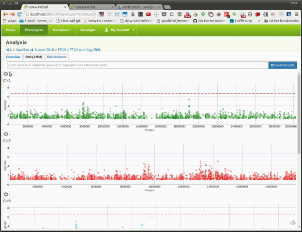 Figure 3 - Settings
Here the user can filter the displayed SNPs based on minor allele frequency or minor allele count. By default the plots are filtered by a minor allele count of 15. This setting is applied to all chromosomes/Manhattan plots.
Here the user can filter the displayed SNPs based on the annotation. It can only display non-synonymous SNPs or genic SNPs. By default all SNPs are displayed. Once the user selects an option, the number of SNPs for that category is displayed next to the symbol.
Here the user can control the coloring of each marker/SNP based. By default the SNPs have the same color. As of now it is possible to color the SNPs based on their minor allele frequency. In future there might be additional options.
Here the user can activate additional tracks to be displayed underneath the Manhattan plot. As of now only one the gene density track is available. In future more tracks will be added and we will add the option to upload user defined tracks.
On the top of the page an autocomplete field enables the user to search for a specific gene or a candidate gene list. By selecting the gene or candidate gene list will highlight the genes in the Manhattan plots with a vertical line. It is possible to add multiple genes/candidate gene lists (see figure 4).

Figure 4 - Searching for genes/candidate gene lists
Clicking on a marker in the Manhattan plot will open a popup with some additional options to choose from.

Figure 5 - Popup when clicking on a SNP
The SNP Detail page will show show additional information for the specific SNP. See this page for more infos.
Sometimes it might be useful to visualize the linkage disequilibrium between the markers in a Manhattan plot. This can be useful to understand complex peaks. Two of the options (Highlight SNPs in LD for this SNP and Show LD in this region) are only available, if an LD analysis was carried out after the GWAS analysis. The LD analysis will calculate pair wise r² values for the top 12500 significant SNPs.
This option is only displayed if the GWAS analysis was followed by a LD analysis
Using the LD data for the top 12500 associations, SNPs that are in high LD will be colored according to their r² value ranging from blue (low LD) to red (high LD).

Figure 6 - Show SNPs that are in high LD with the corresponding marker
This option is only displayed if the GWAS analysis was followed by a LD analysis
Using the LD data for the top 12500 associations, pair-wise r² values for 500 markers around the specific SNP are displayed as a LD triangle plot below the Manhattan plot.
When the user moves the mouse over a SNP in the Manhattan plot, all the markers above a certail r² threshold will be color coded. This way the user can easily find markers that are in high LD with the chosen SNP. Furthermore the corresponding markers in the LD triangle are highlighted.
When the user moves the mouse over a square (pair-wise r² value) in the LD triangle plot, the corresponding two SNPs in the Manhattan plot will be displayed.

Figure 7 - Moving the mouse over a SNP in the Manhattan plot

Figure 8 - Moving the mouse over a square in the LD triangle plot
This option - unlike the first two - is always available. It works the same way as the Show LD in this region option. However unlike the Show LD in this region, this option will calculate pair-wise r² values for all 500 markers around the selected SNP. This will result in a smaller region for the LD triangle plot, as it will consider all the markers and not only the significant ones.
By clicking on the download button on the top right side of the page, a popup will be displayed. The user can select a chromosome and a MAC/MAF cutoff for the static plots.

Figure 8 - Download popup