This exercise allows you to practice and apply the concepts and techniques taught in class.
Upon completion of this exercise, you will be able to:
- Create and render components with multiple props.
- Use props to pass data to components and display the data received through props within the components
- Use inline styles to modify the appearance of components
- Use operators
?and&&to conditionally render content - Use the
useStatehook to create state variables and add state to React components. - Use state variable setter functions to update state and trigger component re-render.
- Create event handler functions to handle user interactions and browser events.
- Create controlled components to manage the form inputs.
- Apply the "Lifting State Up" approach to share the state between components.
- Pass functions as props from a parent component to a child component.
The purpose of this exercise is to practice the core React concepts such as: creating components, passing data through props, working with state, rendering lists, and working with forms (controlled components).
To see the expected result for each iteration, refer to the solution example: React Training - solution.
- Fork this repo
- Clone this repo
cd lab-react-training-vite
npm install
npm run dev-
Upon completion, run the following commands:
git add . git commit -m "done" git push origin master -
Create a Pull Request and submit your assignment.
Inside of the src/ folder, create a new folder named components.
Use the components folder to store all the components that you create in the following iterations.
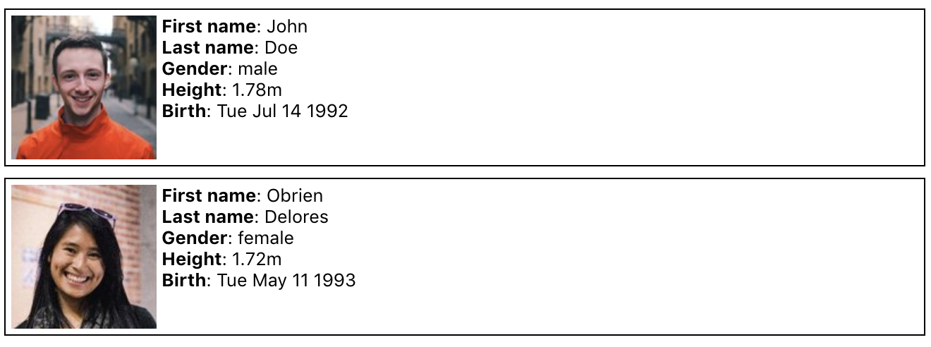
Create and render an IdCard component with 6 props:
lastName: A stringfirstName: A stringgender: A string,'male'or'female'height: A numberbirth: A datepicture: A string
Example:
<IdCard
  lastName='Doe'
  firstName='John'
  gender='male'
  height={178}
  birth={new Date("1992-07-14")}
  picture="https://randomuser.me/api/portraits/men/44.jpg"
/>

<IdCard
  lastName='Delores '
  firstName='Obrien'
  gender='female'
  height={172}
  birth={new Date("1988-05-11")}
  picture="https://randomuser.me/api/portraits/women/44.jpg"
/>
Expected Output:
Create a Greetings component with 2 props:
lang: A string that can have values:"de","en","es"or"fr"children: A text
The component should display a greeting text in the chosen language.
Example:
<Greetings lang="de">Ludwig</Greetings>
<Greetings lang="fr">François</Greetings>
Expected Output:
Create a Random component with 2 props:
min: A numbermax: A number
The component should display a random integer in the range between the min and the max number.
Example:
<Random min={1} max={6}/>
<Random min={1} max={100}/>
Expected Output:
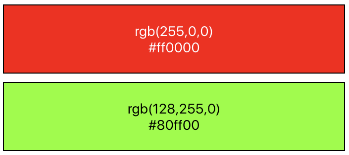
Create a BoxColor component that displays a rectangle with a background color based on props. For this, you will need to add inline styles (documentation).
The component should take 3 props:
r: A number between0and255representing the amount of redg: A number between0and255representing the amount of greenb: A number between0and255representing the amount of blue
Example:
<BoxColor r={255} g={0} b={0} />
<BoxColor r={128} g={255} b={0} />
Expected Output:
As a bonus, you can also display the hex values of the color (e.g., #ff0000 for red).
Create a CreditCard component that displays a rectangle with the information coming from the props.
The component should take 8 props:
type: A string that can be"Visa"or"Master Card"number: A string that is the number of the credit card. For security reasons, you should only display the 4 last digits 😉expirationMonth: A number that represents the month, between 1 and 12expirationYear: A number that represents the yearbank: A string that represents the name of the bankowner: A string that represents the name of the ownerbgColor: A string for the background color of the cardcolor: A string for the text color of the card
Take your time to make the component look as close to the expected output as possible. You'll probably want to use flexbox.
Example:
<CreditCard
  type="Visa"
  number="0123456789018845"
  expirationMonth={3}
  expirationYear={2021}
  bank="BNP"
  owner="Maxence Bouret"
  bgColor="#11aa99"
  color="white"
/>

<CreditCard
  type="Master Card"
  number="0123456789010995"
  expirationMonth={3}
  expirationYear={2021}
  bank="N26"
  owner="Maxence Bouret"
  bgColor="#eeeeee"
  color="#222222"
/>

<CreditCard
  type="Visa"
  number="0123456789016984"
  expirationMonth={12}
  expirationYear={2019}
  bank="Name of the Bank"
  owner="Firstname Lastname"
  bgColor="#ddbb55"
  color="white"
/>
Expected Output:
Create a Rating component that displays 5 stars. Depending on the value received, some stars should be empty (☆), and some should be filled (★).
The component should take 1 prop:
children: A number between0and5. The value can be a floating-point number. If the number received is3.9, the component should display 4 stars.
Example:
<Rating>0</Rating>
<Rating>1.49</Rating>
<Rating>1.5</Rating>
<Rating>3</Rating>
<Rating>4</Rating>
<Rating>5</Rating>
Expected Output:
Create a DriverCard component that displays a rectangle with content based on the received props.
The component should take 4 props:
name: A stringrating: A number between0and5. The value can be a floating point number.img: A stringcar: An object with propertiesmodelandlicensePlate.
Example
<DriverCard
  name="Travis Kalanick"
  rating={4.2}
  img="https://si.wsj.net/public/resources/images/BN-TY647_37gql_OR_20170621052140.jpg?width=620&height=428"
  car={{
    model: "Toyota Corolla Altis",
    licensePlate: "CO42DE"
  }}
/>

<DriverCard
  name="Dara Khosrowshahi"
  rating={4.9}
  img="https://ubernewsroomapi.10upcdn.com/wp-content/uploads/2017/09/Dara_ELT_Newsroom_1000px.jpg"
  car={{
    model: "Audi A3",
    licensePlate: "BE33ER"
  }}
/>
Expected Output:
Create a LikeButton component that displays a button with the initial text "0 Likes". With each click, the number of Likes should increase.
As a bonus, implement the background color change on each click. You can use the following array of colors: ["purple", "blue", "green", "yellow", "orange", "red"]
Example:
<LikeButton />Expected Output:
Create a ClickablePicture component that displays a picture. On each click, the picture should toggle between the two images passed through the props.
Example:
<ClickablePicture
  img="maxence.png"
  imgClicked="maxence-glasses.png"
/>
Expected Output:
PS: If you want to use your picture instead, you can create it using this picture: /assets/images/glasses.png 😎
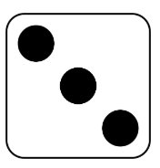
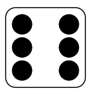
Create a Dice component that displays a picture with the random dice value (example: '../assets/images/dice3.png').
Every time the user clicks on the component, it should:
- First, display an empty picture (
'../assets/images/dice-empty.png') - 1 second later, display a new random picture (example:
'../assets/images/dice6.png').
Example:
<Dice />Expected Output before the click:
Expected Output immediately after the click:
Expected Output 1 second after the click:
Create a Carousel component that displays an image and two buttons (Left and Right), which change the picture on each click, respectively.
The component should take 1 prop:
images: An array of strings. Each string should be an image URL.
Example:
<Carousel
  images={[
    "https://randomuser.me/api/portraits/women/1.jpg",
    "https://randomuser.me/api/portraits/men/1.jpg",
    "https://randomuser.me/api/portraits/women/2.jpg",
    "https://randomuser.me/api/portraits/men/2.jpg"
  ]}
/>
Expected Output:
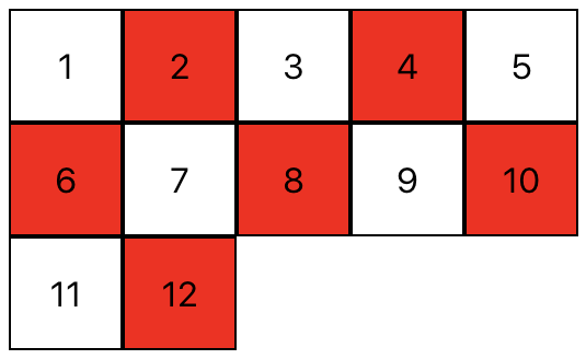
Create a NumbersTable component that displays a list of numbers between 1 and the limit. Even numbers must be colored in red.
The component should take 1 prop:
limit: A number.
Example:
<NumbersTable limit={12} />Expected Output:
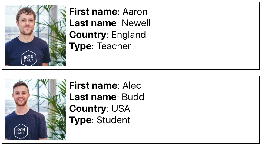
Create a FaceBook component that displays the list of all profiles coming from the file src/data/berlin.json. Remember to import the json data in the component:
import profiles from "./data/berlin.json";Example:
<FaceBook />Expected Output: (you should see about 28 profiles)
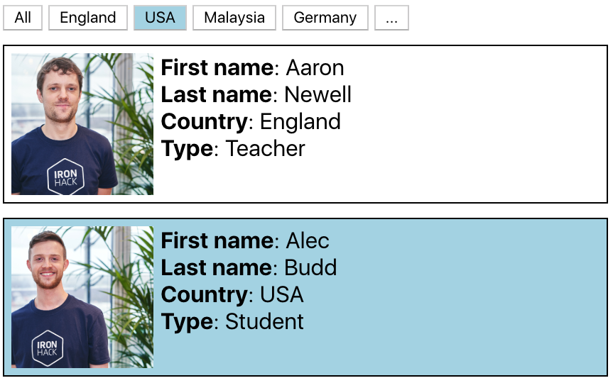
Update your FaceBook component and add a button for each country the students come from; Each student object has a country property. When the user clicks on the button with the country name (example: USA), add a blue background to all the profiles where the country is the one selected.
Example:
<FaceBook />Expected Output: (note: part of the content in the screenshot was cropped)
Bonus:
- By default, only display the picture. Then, when a user clicks on a picture, display more information
- Add sort buttons
- Add a search input
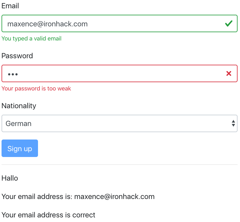
Create a SignupPage component with the following elements:
-
An
inputof type"email"(bonus: make the input green/red when the email is valid/invalid) -
An
inputof type"password"(bonus: make the input green/red when the password is strong/weak) -
A
selectinput, used for selecting a nationality, with possible options/values:"en","de","fr" -
A paragraph displaying
"Hello","Hallo"or"Bonjour"based on the selected nationality -
A text "Your email is [email protected]"
For this, you will need 3 state variables:
emailpasswordnationality
If you want to include Bootstrap with Reactstrap, you should run
npm install reactstrap bootstrapAnd add the following line in src/main.jsx
import "bootstrap/dist/css/bootstrap.min.css";Example
<SignupPage />Output
Create 2 components:
-
The
RGBColorPickercomponent, that displays a square with an rgb color coming from the state. The component should have the following state variables:-
rValue: A number between0and255, representing the amount of red -
gValue: A number between0and255, representing the amount of green -
bValue: A number between0and255, representing the amount of blue
-
-
The
SingleColorPickercomponent should have an input field of type"number", and allow the user to select a number between0and255.The component should take 3 props:
color: A string that is either"r","g"or"b"value: A number between0and255onChange: A method that is triggered when the input is changed
The RGBColorPicker should render 3 SingleColorPicker components and send the state values to them.
Example:
<SingleColorPicker
  color="r"
  value={rValue}
  onChange={ () => { /* ... */ }  }
/>

<SingleColorPicker
  color="g"
  value={gValue}
  onChange={ () => { /* ... */ }  }
/>

<SingleColorPicker
  color="b"
  value={bValue}
  onChange={ () => { /* ... */ }  }
/>
Expected Output
Happy coding! ❤️

