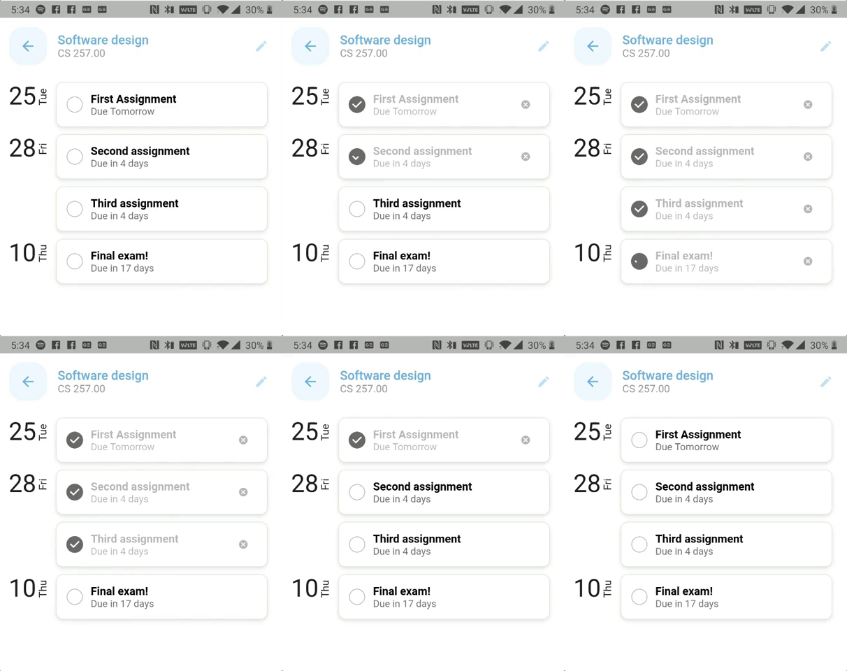
A modified version of the existing checkbox with the shape of a circle instead of a rounded rectangle!
Add this to your package's pubspec.yaml file.
dependencies:
   circular_check_box: ^x.y.z
Now in your Dart code you can use:
import import 'package:circular_check_box/circular_check_box.dart';To use CircularCheckBox widget simply include it in your build method like this:
CircularCheckBox(
    value: this.circularSelected,
    onChanged: (value) {
        this.setState(() {
            this.circularSelected = value;
        });
    },
),
The CircularCheckBox can be customized with many properties, including:
tristate- the circular checkbox will have three states: unselected, selected with a check and selected with a dashcheckColor- change the color of the check iconactiveColor- change the color of the selected circular checkbox
This package is null safe ready, so it can be used with the new dart's Sound Null Safety.
Watch the License file here
Refer to the Changelog to get all the release notes.

