Vector Tutorial (QGIS section)
Importing the data into QGIS is as simple as opening up QGIS, unzipping the downloads, and dragging each of the .shp files into the QGIS window, starting with the airports layer, then moving on to the cities layer, and then finally the states layer. (If you get any sort of warnings, just click OK through them all for now. If you're interested in understanding what they mean, read the optional extra part of Step 3.) Each dataset will be represented within QGIS as a layer, which can be seen in the layers panel on the bottom left of the window. Just like in programs like Photoshop, these layers tell QGIS which datasets should be drawn "on top" of others. The drawing order of layers has no effect on any of manipulations or math that we'll be using, but for obvious reasons, it isn't a good idea to have the US States polygons covering up the airports and populated places point datasets. Make sure that you states dataset is below all the others by dragging it to the bottom like so:
Note that for all these symbols, the colors are chosen randomly. You can change them by double clicking on the layer name and going to the "Symbology" tab of the window that pops up.
Now that we have all the datasets into the program, it's time to take a quick tour.
First, let's take a look at the navigation tools, found near the left of the top of the window (highlighted in red above). The hand tool  pans around the map, and, with it selected, you can also zoom in or out by scrolling. Moving over two items, you have the zoom in and zoom out tools
 , which do exactly what they say on the tin. (One quick tip about the zoom in tool: you can draw a rectangle around the area you wish to fill up your view and it will zoom and pan accordingly.) Next is one of the most useful tools, the zoom full tool
  which I like to think of as the zoom to fit tool. It zooms so that all of your shape features are visible. After that is the zoom to selection tool
 , which zooms to fit all of the selected shape features in view, and the zoom to layer tool
 , which does the same with the currently selected map layer. Finally, looking at the last two icons in that image, those are the undo and redo zoom buttons
 . If you accidentally zoom somewhere you didn't mean to, you can undo it with these.
Much of the rest of the tools will come up naturally throughout this tutorial, but one last useful tool you should know about is the Identify Features tool  (highlighted in blue above). If you select this tool and click on any shape feature in the currently selected layer, a side panel will open up and display some information about that feature. (The currently selected layer is the one in the bottom-right layers panel that is underlined. You can change the currently selected layer by just clicking on the layer you want to be selected.) For example, if you were to use the zoom in tool to zoom to the continental US and then select the identify features tool and click on Texas, your window should look something like this:
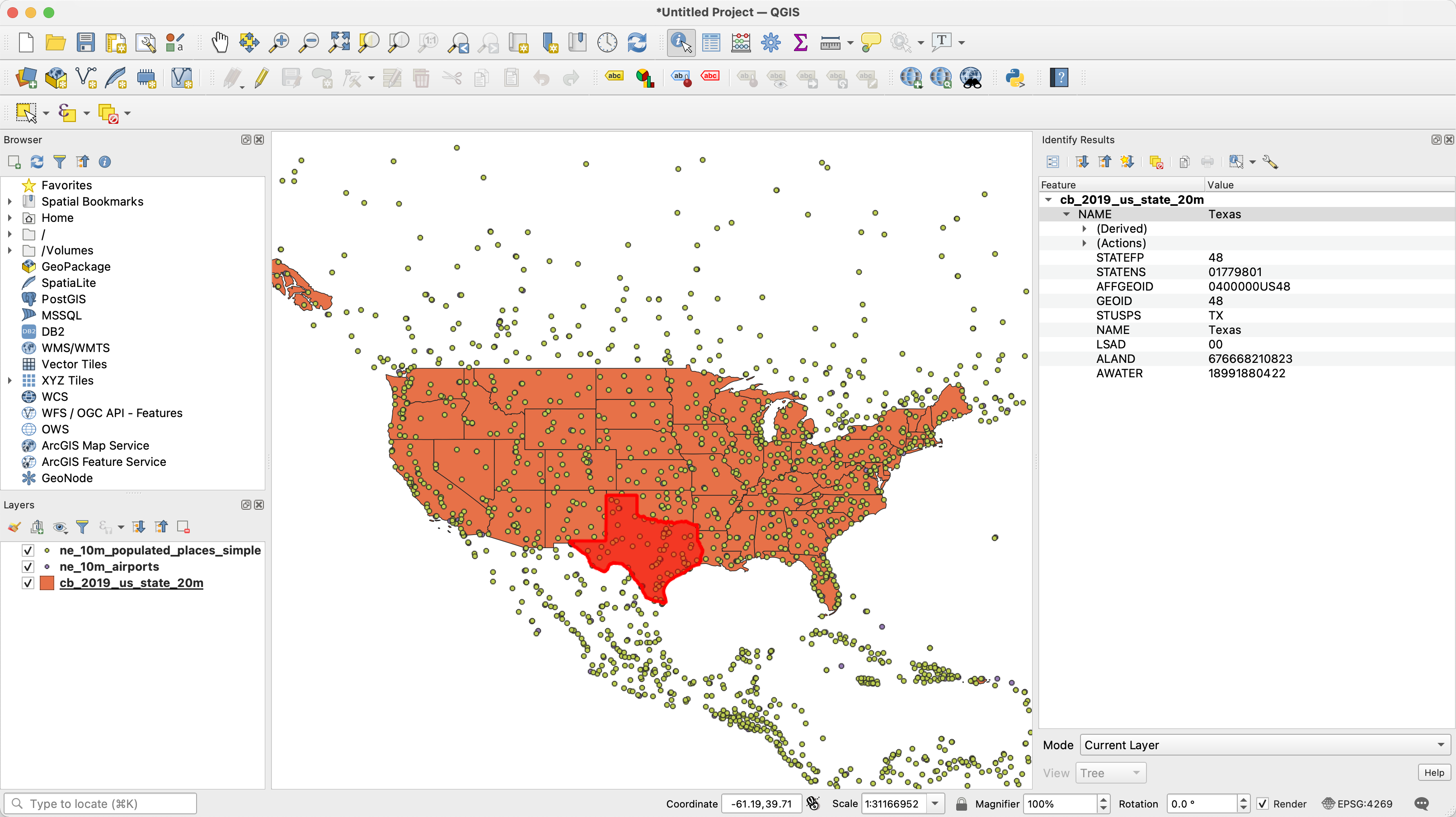
If you look on the right you can see everything that QGIS knows about that feature representing Texas. If you click on the "(Derived)" sub menu, you can see things that QGIS has calculated like the area, but everything else there is something that was specified by that feature's row in the attribute table of that dataset. In other words, the attribute table for the layer cb_2019_us_state_20m has columns called "STATEFP", "STATENS", "AFFGEOID", etc., and for Texas, those values are 48, 01779801, 0400000US48, etc. The identify tool lets you quickly surface this information for any given feature.
Like all data, GIS data is rarely exactly ready to use for your application right out of the box. As an example for non-spatial data, perhaps you want to filter out all data points that are more than five years old. To do so you could use Excel and sort by collection date and delete all rows that are too old. Or perhaps you would write an SQL query to only grab recent data. Conveniently, GIS tools can do this kind of table-based cleanup, but the real power of a GIS system is in its spatial intelligence.
Let's start simple. Since we don't plan on including any airports in Alaska, Hawaii, or Puerto Rico, let's go ahead and filter out those three places. We could do this non-spatially in the attribute table, but the quickest and easiest way is just to drag a selection box over the whole continental United States and save it as a new shapefile.
First on the layers menu on the bottom left of the window, click the checkboxes of both of the point layers so that the only active layer is the cb_2019_us_state_20m layer. Next, select the Select Features tool  . (Remember you can hover over any tool's icon to get its name). Now select the
 cb_2019_us_state_20m layer by clicking on it (after selection the name should appear underlined.) Once you have the selection tool active and the desired layer selected, drag a rectangle around the continental United States. All the selected features should turn bright yellow. Now, right click the cb_2019_us_state_20m layer and hover down to Export and click on Save Selected Features As.
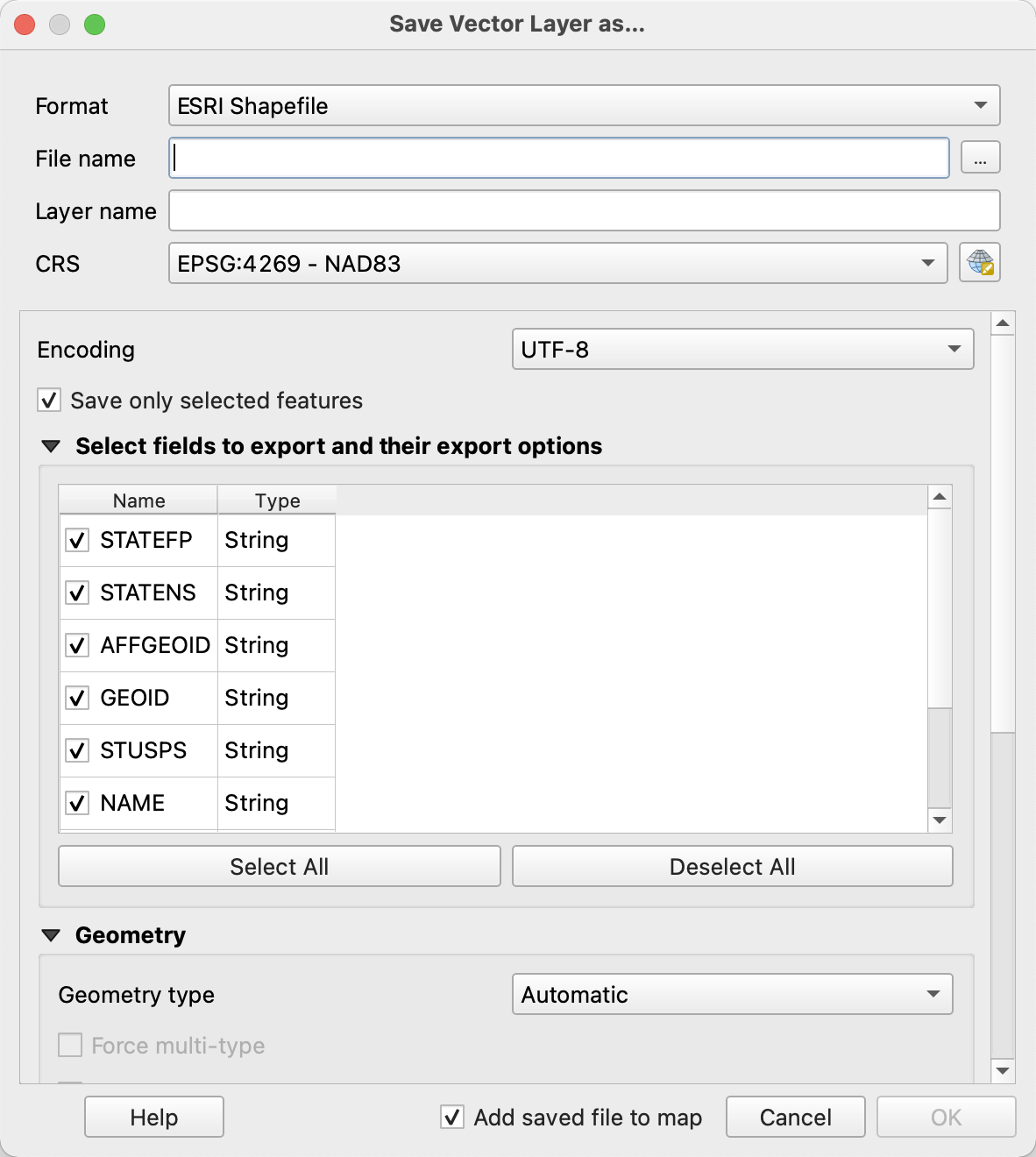
A window like this should pop up. First of all, you should make sure that on the top of the window, the Format drop-down is set to "ESRI Shapefile." This is the more common of the two file formats the GIS extension can read, so it makes the most sense to just do everything in shapefiles instead of dealing with QGIS specific formats or anything like that. Once you set this once you shouldn't have to change it again.
The only other thing you need to change here is the location on your disk where you want to store the newly created shapefile. Pick a directory you can keep track of and give the exported file a descriptive name like states_continental.shp. Click OK and a new layer should show up in the layers pane. Now that you have this new layer, you can go ahead and right click on the old cb_2019_us_state_20m layer and hit Remove Layer.
Working non-destructively like this is a useful habit to get into. Often GIS operations take a not-insignificant amount of time and so it would be a shame for you to make some not-undo-able error and have to start back at the base data and work your way back to where you were. By making each step of the process a new shapefile, your directories may get a bit crowded (hence the need for descriptive names) but you have the peace of mind that you can always go back to prior versions of shapefiles.
Now that we've narrowed down to the states that we're interested in, we have to do the same for the airports. First, enable the ne_10m_airports layer by clicking on its checkbox. What we want is to get rid of all those airports that are not within the continental states. We could do this manually with the selection tool again, but here we can leverage a GIS tool to make our lives significantly easier.
Open up the Toolbox panel by clicking on the gear icon three to the right of the inspect icon on the top row. Type "clip" into the search par within the toolbox panel and, under Vector Overlay, double click on Clip.

This should open up a new window with some options for the Clip tool. Click on the top drop-down menu and change it to ne_10m_airports. Your window should look like this:
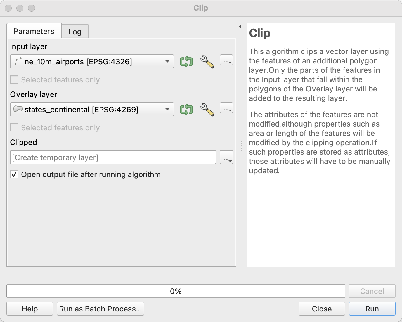
As you can read on the right of the window, Clip works like a cookie cutter. The input layer is the cookie dough and the overlay layer is the cookie cutter. Everything inside the overlay layer is kept and everything outside is discarded.
Once you click run you should see a new temporary layer with just the airports we want called Clipped. Go ahead and close the clip window and disable the original ne_10m_airports layer. (You can tell that the Clipped layer is temporary because of the little RAM/computer chip icon to the right of it.) Once you've confirmed that your clip operation did what you meant it to do, you can right click on the Clipped temporary layer and export it as a new layer by clicking on Export > Save Features As. Give it a descriptive name like ne_10m_airports_continental_US and remove the temporary layer.
Before moving on from the Clip Tool, it would be remiss not to mention that the Clip Tool can be used to clip more than just points, it can clip line and polygon features as well. Say for example you had a line dataset representing the all the highways in the United States, but only wanted the parts of those highways that were inside of the state of Texas. You could clip the highways layer by the Texas layer and it would "cut" the highways appropriatly so that everything outside of the cookie cutter of Texas would be discarded.
Next we want to narrow down our set of airports to only relatively major ones. Thankfully the dataset we are using has a field called "scalerank". While this metric was created to allow map makers to specify at what zoom level a certain airport should be displayed, it is an imperfect but good enough metric to select a few major airports for our toy model. Since we want to narrow down our data by using one of its fields, one convenient way to do so is to use the layer's attribute table.
We've discussed attribute tables a few times so far but have yet to open one up, so lets go ahead and do that now. Right click on the newly created ne_10m_airports_continental_US layer and click on Open Attribute Table. Your window should look like this, if it doesn't, consult the note below.

(Note: In QGIS, there are two different views of the attribute table, the table view, which looks like a traditional table or spreadsheet, and the form view, which allows you to look at one row/record at a time. For this section, if you are in the form view, click on the icon in the very bottom right of the Attribute Table window and switch into the table view.)
With this table, you can navigate around by scrolling or using the scroll bars. If you wanted to Edit any of these values, you could click on the pencil icon in the top right to enter an editing session where you could click on a cell to modify it. To save your changes, you must click on the save icon to the right of the pencil to save all your session edits. (Like I mentioned before, it is often best to save a version of a shapefile before making any changes in this way because undo is not always an option.)
Getting back to our task of grabbing only major airports, click on the column header for "scalerank" to sort all the rows by this value. Then click on the row header for row number 1, hold down "Shift" and click on the row header for row number 12, the last airport with a scalerank of 2 (indicating one of the most "major" airports). The selected columns should be highlighted blue like so:

If you close the attribute table now you will see that the dots representing these 12 airports have lit up yellow. This is an important thing to note: selections are shared between the attribute table view of a dataset and the spatial/map view of a dataset. Now that we have selected these major airports, we can export these selected features as a new layer like we did before by right clicking on the ne_10m_airports_continental_US layer and clicking Export > Save Selected Features As. Give it a name like ne_10m_airports_major_continental_US and remove the old ne_10m_airports_continental_US Layer.
To quickly illustrate another feature of QGIS, we are going to look at an alternate method of isolating only major airports like we just did, this time by deleting features we don't want instead of selectivly exporting those we do. Follow along if you like.
To modify features in QGIS, whether that be modifying their shape, the values of their fields, or outright deleting them, you need to be inside of an editing session. While inside an editing session, all changes you make are temporary until you manually save them. To start an editing session, select the layer you want to edit and click Toggle Editing  . A whole bunch of tools that were greyed-out should gain their color back upon starting an editing session.
Now that we're in an editing session, we can select the airports that we want to delete. To do so, open up the attribute table for the ne_10m_airports_continental_US layer. If you click within any of the cells of the attribute table, you'll notice that you can edit them like you would an Excel spreadsheet now that we're inside an edting session. We could once again sort by scalerank and manually select those airports with a scalerank of 2 and then use the Invert Selection button  to select the airports we want to delete, but instead we're going to use the Select Features By Expression tool
 to do the manual work for us.
Once you click on the Select Features By Expression tool itself, a dialog box should open up where you can type in a QGIS expression to be evaluated. Now, if you're familair with SQL, you can think of expressions as the WHERE clause in a SQL SELECT, but that analogy is just that, an analogy. QGIS expressinos are their own thing and only a subset of SQL features are present. Expressions are meant to be powerful enough for quick filtering and the like, but anything more complicated should really be written in python in the "Function Editor" tab. Since our use case clearly falls into the first category, we'll be using them here.
In the middle pallete of tokens, click on the "Fields and Values" header to expand it. Scroll down to "scalerank" and double click it to insert it into the expression builder on the left. Then click over to the expression builder itself and type !=. Then, on the right third of the dialog box, click on "All Unique" to get a list of possible values for "scalerank". Double click 2 to insert it into the expression builder as well. The completed expression should read "scalerank" != 2, and indeed you can just type in the expression directly as well if you prefer. In either case, to actually use the selection, click Select Features. You should see a notification in the main QGIS menu that 110 features have been selected. You can now close this dialog box and actually perform the delete with the Delete Selected Features button  .
.
Like I mentioned above, to actually make these changes permanent, you have to manually save them. You can use the floppy-disk-save icon to save the changes directly, or you can just close the editing session with the Toggle Editing button and direct QGIS to save the changes when prompted. Remember that it often isn't ideal to work destructivly like this, and that in most cases the extra disk space taken up by the intermediary files is worth the extra workflow flexability of working non-destructivly, but its good to know the option is there for when you need it.
By now you should have a set of 49 polygons representing the 48 continental united states and DC as well as a set of 12 points representing a few major US Airports. If you look around in attribute table for the airports layer or inspect one of them with the identify features tool, you will see that Natural Earth provided us with plenty of useful information about each airport including its name, IATA airport code, its wikipedia unique ID, and more. However it does not contain the key piece of information that we need for our virus transmission model: the size of the population it serves.
Now, there are a few ways we could go about this. First of all, since we are only dealing with 12 data points, manually entering the data is a perfectly reasonable, and probably the most accurate, choice. This allows for judgement calls like noticing that Newark Airport is on our list but not JFK or LaGuardia from New York City, so we should probably make Newark's population it services encompass New York City's population as well. (This is another bit of evidence that scalerank is an imperfect metric as JFK airport served around 16 million more passengers than Newark in 2019 according to wikipedia.) But for the sake of this tutorial I'm going to show you a different way to estimate population served using one of the most powerful tools in GIS -- the spatial join.
A traditional non-spatial table join is any operation where data from two different tables is combined or joined together into a third new table with some amount of information from both. For example, an SQL inner join could be used when you have a table with literacy data about each state in one table and education funding data about each state in another. You can use an inner join to match the data up by state so that in the end you have a table with both literacy and education funding data by state.
Spatial joins are similar except that instead of matching up data rows based on a shared key, table rows are matched up based on spatial information like polygon intersection, point distances, etc. Given our US states shape dataset and our populated places dataset, various spatial joins could help us answer questions like: "What is the largest City in each state?" or "How many cities with population over 50,000 are there in each state?". Or, if we change our perspective from getting information about the cities within each state to getting information about the state each city is in, we could use a spatial join to answer the question "What state is each city in?" since our dataset doesn't have that information already.
For our purposes we are going to be asking a fairly simple question (with a more complicated question as an optional addendum): what is the population of the city nearest to each of our major airports. To answer this question, we are going to use the Join Attributes By Nearest tool (a more specific name for a kind of spatial join where the join criteria is closest distance) found within the toolbox. You can open the toolbox by clicking the toolbox icon  and search for the tool in the search bar. Once you have the tool's window up, change the input layer to our newly created
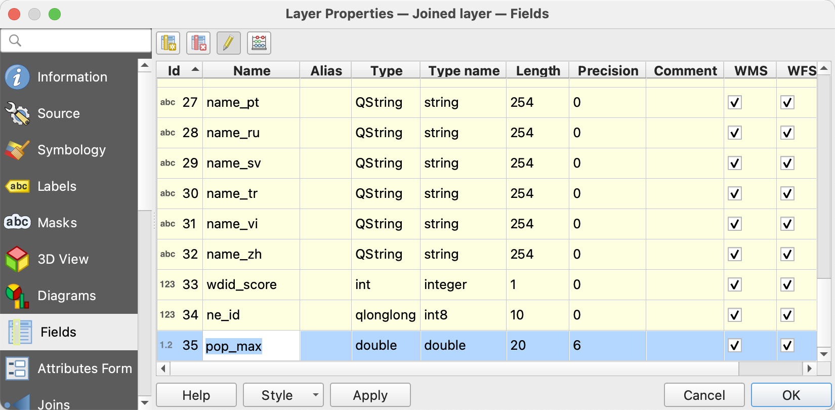
 ne_10m_airports_major_continental_US layer and the input layer 2 to ne_10m_populated_places_simple. Then, click on the three-little-dots button beside the "Layer 2 fields to copy" field. Scroll down and click on the check box next to "pop_max" like so:
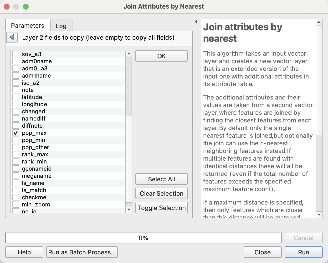
Hit Run and then Close and take a look at the newly created Joined Layer temporary layer. If you open up its attribute table or inspect it with the identify features tool, you will see that in addition to all the fields it already had, it now has a "pop_max" field representing the population of the city nearest to it. (You can also hit the check box for the "name" field to get the name of that city if you want to double-check that the intended cities were chosen.)
Now we can once again save our temporary layer out to a new shapefile by right clicking on the layer and hitting Export > Save Features As. One thing you might want to do for cleanliness' sake is only export those fields that you care about since this is the final version of our airports shapefile that we are going to be importing into NetLogo. To do so, hit the Deselect All button and only select the "name", "abbrev", and "pop_max" fields. Give it a descriptive name like final_airports_with_populations.
Congratulations, you've completed the QGIS portion of this tutorial. Before we move on let's review what we learned how to do:
- Import data into QGIS
- Navigate around the map and inspect features
- Manually select and selectively export data using the map window
- Clip datasets by another polygon (cookie cutter)
- Manually select and selectively export data using the attribute table
- Perform a basic spatial join operation to combine two geospatial datasets.
If you want to learn more about how to use QGIS, I recommend looking at the official documentation and tutorials at https://docs.qgis.org/. Among other things, these tutorials will teach you how to use symbology tools to create visually informative maps, perform more powerful geospatial analysis and processing operations, and work with different map projections and geospatial datums or reference frames.
One flaw with our final dataset is that it assumes that each airport only services the single city closest to it, however, if you zoom in near O'Hare international airport you can see that there the city of Evanston is only a little bit farther away than Chicago and has a population that we should take into account, and we've already discussed the glaring issue with Newark Airport not taking New York City's population into account. To remedy these errors we need to employ a more sophisticated multi-step spatial analysis.
At a high level view: we are going to create a 50 mile buffer around each of our airports and sum up the populations of every city that falls within that buffer and then transfer that value back to the airport. This is not the only way to do this operation but it does illustrate that often when working with a GIS program you may need to create temporary auxiliary layers and combine a number of different geoprocessing tools to get the value that you want.
While it is possible that someone in Vancouver might cross the border to fly out of SEA-TAC in Seattle, it isn't all that likely, so let's go ahead and only consider US cities. Use this opportunity to check if you can use the clip tool to clip the ne_10m_populated_places_simple layer by the states_continental layer. Remember that one layer is the cookie cutter and the other is the cookie dough. Go ahead and save that clipped layer as us_cities.
To create a buffer around a point, you use the buffer tool. You can find it by searching for it in the toolbox. Change the input layer to ne_10m_airports_major_continental_US and it should look something like this:
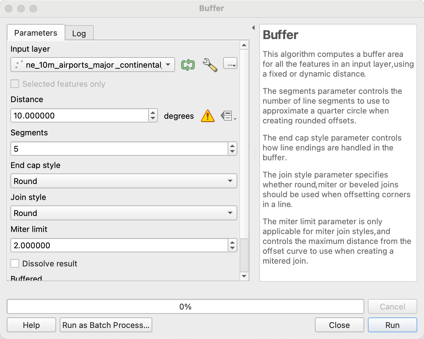
One thing you may notice in this window is that for the distance field, the only unit available to you is degrees, but we want to create our buffer with a distance of 50 miles. What's with that?
Well right now all our datasets are a geographic coordinate system, or a coordinate system that is defined by distance in degrees of latitude and longitude (more specifically longitudinal distance from the prime meridian and latitudinal distance from the equator). All our data is in degrees and QGIS doesn't know how to implicitly convert into meters that we can use to create our desired buffer. To use a linear surface distance measure like meters, we need to reproject our data into a projected coordinate system, or a coordinate system that is defined by simple cartesian distance.
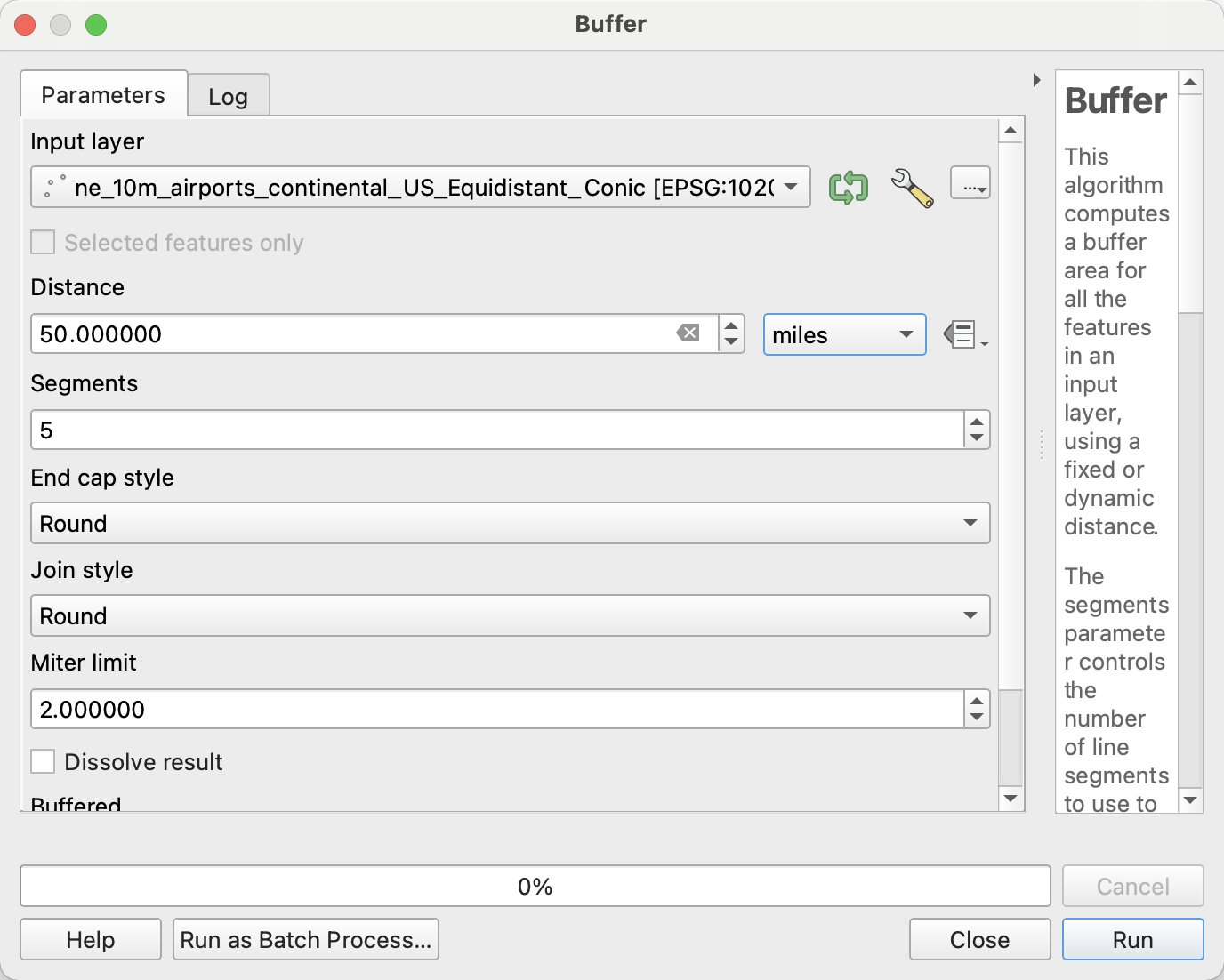
We have a number of different choices of which map projection, and therefore projected coordinate system, we want to use. (For a list of many different map projections, see this list on Wikipedia.). For our purposes, since we are trying to compare the distances between various points, we want to pick a map projection that prioritizes preserving distance. Generally the tradeoff when choosing a map projection is between higher accuracy at over a smaller area and lower accuracy over a larger area, so you often want to choose a map projection that is specifically designed to perform well at your chosen scale in your specific area of interest. For this reason, we are going to reproject our airports dataset into QGIS's built in "USA_Contiguous_Equidistant_Conic" projection because it does a good job of preserving distances within the continental US.
To reproject we simply start exporting our ne_10m_airports_major_continental_US layer like we have before with Export > Save Features As and hit the little globe icon to the right of the CRS drop-down. This will open up a map projection picker that lets you search through every map projection that QGIS knows about. Type "USA_Contiguous_Equidistant_Conic" into the search bar at the top and double click on the only result. Save the layer as ne_10m_airports_major_continental_US_Equidistant_Conic (I told you we'd be dealing with long descriptive file names) and hit OK.

While normally the point for the new layer would be directly on top of the old points, after all, they are the same location just represented differently, but sometimes QGIS doesn't have a good time reading in map projections and gets confused. While this may not have happened on your machine/version of QGIS, it did on mine so here's how to fix it -- its a useful skill to have either way. Simply right click on the newly created layer and click Set CRS > Set Layer CRS. A similar map projection selection window should pop up. Simply select the "USA_Contiguous_Equidistant_Conic" projection we used to save the file and the points should show up in the right place.
Now that we have created an airports layer that is relative to a projected coordinate system, when we open up the buffer tool and select our new ne_10m_airports_major_continental_US_Equidistant_Conic as the input layer, we should be able to create a buffer of the 50 miles that we intended.
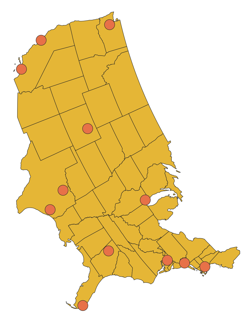
If we hit Run, we should see a few not-quite-circles show up on our map like so:

These buffers are not perfectly circular because we are looking at a circle that was generated in one map projection but is being displayed in a different one and when you go from one projection to another there is always distortion somewhere. If we were to change the QGIS display map projection by clicking on the button on the bottom right hand of the window that says "EPSG: 4326" (the current display map projection) and set it to "USA_Contiguous_Equidistant_Conic", the map projection the buffers were created relative to, then they would look like perfect circles again:
(If you want to return to the original default map projection, choose "WGS 84" from the display projection selection menu)
If you turn the us_cities layer back on, you should see that we now have circles of 50 mile radius surrounding each airport and containing a number of cities beyond just the single nearest. Our challenge now is to take each city within each of those buffers and sum up their populations. To do this, we will use a Summary Spatial Join using the Join Attributes by Location (summary) tool in the toolbox (which can be found by searching).
Set the input layer to our newly created buffer layer, Buffered and set the Join layer to us_cities. This arrangement will allow us to take values from the cities layer and join them onto rows of the Buffered layer. Now we need to select which columns from the join layer (the cities) to summarize and which summary statistic we want to use. For Fields to summarise, click the three little dots and hit the checkbox for "pop_max" and for Summaries to calculate, hit the three little dots and hit the checkbox for "sum". Once you hit Run, there should be a new Joined layer layer in the layer pane. Select that layer and use the Identify tool to check that your calculation was successful. If it was, there will be a new "pop_max_sum" field on each of the circles. (You should also take note here that the buffer operation transfers all data fields from the shapes being buffered into the buffers themselves.)
Now that we have a layer of buffer polygons that know their own aggregate population, we can spatial join that information back onto our airports point layer. To do so, open up the Join Attributes by Location tool from the toolbox and set the Base Layer to be the airports layer and the Join Layer to be the newly created temporary Joined layer. Now we can use the three little dots next to the Fields to add selector and just hit the checkbox for the "pop_max_sum" field. You should see a newly created Point layer (unhelpfully also) called Joined layer. If you inspect one of these points, you should see that it has a new "pop_max_sum" field the represents the sum of all the populations of all the cities within 50 miles, exactly what we wanted to calculate.
If you are going to be moving forward with this tutorial having finished these steps, you probably want to rename the population field from "pop_max_sum" to "pop_max" so that you can continue to follow along without changing the name in the NetLogo code. To do so, double click on the new point Joined layer and select the Fields tab from the sidebar. Here you should see a table with a bunch of rows representing field names and properties. To make edits, you have to start an editing session by clicking the pencil icon near the top of the window. Once in an editing session, you can simply click on the "pop_max_sum" text and change it "pop_max".
Once you've made the edit, you can click on the pencil icon again and say that you want to save your changes. Go ahead and exit that window and export this point Joined layer as final_airports_with_populations like you did with the prior version. You're now ready to move on to the NetLogo section of the tutorial.