Creating applications does not necessarily mean creating complex processes. We're building tools to enable you to go from design to productions as effortlessly possible.
Swapping out library files is a fairly ubiquitous task, and there are plenty of plugins that can do this for you. But we're not just swapping out one library for another. We're creating a system that empowers you to create any number of libraries based on a simple Component & Token structure, interchange them with each other and ultimately hand them over to dev for quick implementation.
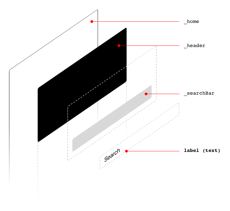
Everything from applications to websites are created based on Components. Components are the building blocks of everything. Examples of commonly used components are:
- Header
- Footer
- Buttons
- Search Bar
At the micro level, components are made up of Tokens. Tokens are the smallest and undividable building blocks of our designs. Tokens carry all the information we need to style our applications eg. Text Styles, Layer Styles and Icons. Examples of commonly used Tokens are:
- Title (text style)
- Subtitle (text style)
- Label (text style)
- Background (layer style)
- Search Icon (icon)
- Arrow Icon (icon)
Components can be nested, thus creating even more complex systems within our designs. An example of a nested component path would be: home/header/searchBar/label
Given the above structure home/header/searchBar/label, the matching hierarchy is as follows:
home/header/searchBar/labelheader/searchBar/labelhome/searchBar/labelhome/header/labelsearchBar/labelheader/labelhome/labellabel
Similar to states, Variants can be used to describe a specific state of a Component but they can also be used to specifiy a variant of that Component as well. Variants are specified by appending the variant name enclosed in brackets to the Component name.
_button_button[active]_button[highlighted]
_carousel_carousel[fullWidth]_carousel[paged]
_block/availability/available_block/availability/available[selected]_block/availability/out-of-stock_block/availability/out-of-stock[selected]
Modifiers are extra properties that are applied to Tokens, which are not included in Sketch's Text Style or Layer Style. Currently, we only support the Radius ( --radius) modifier.
If we need to apply a radius to a layer, we would use a radius modifier:
Create a new artboard named tag/background --radius, and in that artboard we would include a single layer with the required radius.
Token: A Token (or Composite Token) describes the smallest and undividable parts of your design. Tokens are Text Styles, Layer Styles or Icons.
Component: A component is made up of Design Tokens and nested Components and represents more complex re-useable structures in your designs.
Variant: Variants are used to describe a specific state or variant of a Component.
- Components must have unique names.
- Components must have an underscore (
_) prepending their names. - Variants can only be applied to Components.
- A default of each Design Token is required.
