This is deprecated - Use card-mod instead as far as possible
Note: card-mod does not support modding entity rows - other than that it's better than card-modder in every way
Allows you to style a home-assistant lovelace card
This card requires card-tools to be installed.
For installation instructions see this guide.
| Name | Type | Default | Description |
|---|---|---|---|
| type | string | Required | custom:card-modder |
| card | object | Required | The card you wish to style |
| style | list | none | List of css styles to apply to card |
| extra_styles | string | none | Extra style data to add to card environment |
| report_size | number | none | Size to report |
card-modder can be used to apply CSS styling to any lovelace card.
Styles are automatically applied recursively to all cards within stacks.
Any CSS style can be used, and will be applied to the base element of the card
(<ha-card>). Most cards use css variables for styling, and to find out which
ones, I recommend either the official "partial list of variables
used"
or that you open the card in your browsers object inspector and check out the
styling options manually.
- type: custom:card-modder
  style:
    --paper-card-background-color: rgba(0, 100, 0, 0.2)
    --paper-item-icon-color: white
    border-radius: 5px
    color: rgb(0, 0, 100)
  card:
    type: glance
    title: Styled card
    entities:
      - light.bed_light
      - light.ceiling_lights
      - light.kitchen_lights
- type: glance
  title: Unstyled card
  entities:
    - light.bed_light
    - light.ceiling_lights
    - light.kitchen_lights
Note about rounded corners: Some cards which have a background image needs the style overflow: hidden added for rounded corners to work.

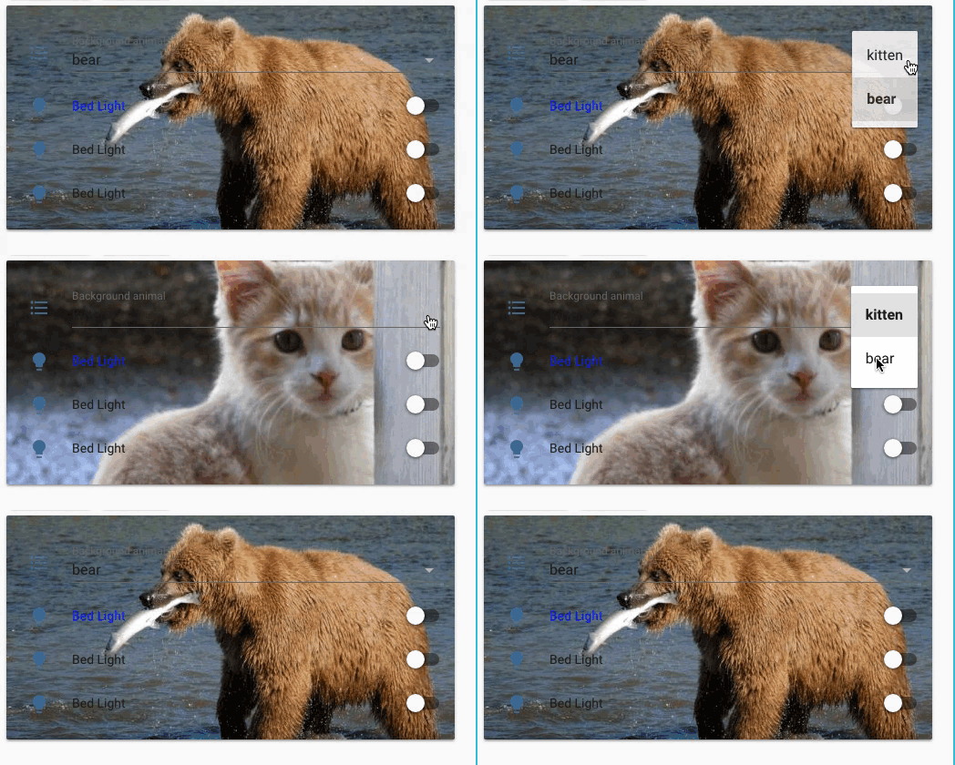
A simple form of templates can be used in the styles.
Templates are on the form [[ domain.entity.state ]] or [[ domain.entity.attributes.attribute_name ]].
- type: custom:card-modder
  style:
    background-image: "url(http://www.place[[ input_select.background.state ]].com/600/250)"
  card:
    type: entities
    entities:
      - input_select.background
      - type: custom:card-modder
        card:
          type: custom:hui-toggle-entity-row
          entity: light.bed_light
        style: {color: blue}
      - light.bed_light
      - light.bed_light
Note that this doesn't work reliably with stacks at this point.
Card-modder adds styles to the ha-card element of a lovelace card (if found). The extra_styles parameter can be used to inject code directly into a style tag being a sibling of the ha-card.
This allows e.g. for blinking backgrounds:
type: custom:card-modder
style:
  animation: [[ sensor.button_animation.state ]] 2s linear infinite
extra_styles: >
  @keyframes blink {
    50% {
      background: red;
    }
  }
card:
  type: entity-button
  entity: light.bed_light
Here sensor.button_animation is a template sensor which is setup such that when the button should be blinking it has the value blink, and no value otherwise. E.g:
sensor:
  - platform: template
    sensors:
      button_animation:
        value_template: "{% if is_state('light.bed_light', 'off') %}blink{% endif %}"
Example by Isabella Gross Alström.
By default lovelace orders cards on the screen in columns. To predict where a card will pop up there are a few rules:
- Each card has a vertical size. The size is specified in units of roughly 50 pixels.
- Cards are placed in the order they are specified in ui-lovelace.yaml
- Cards will be placed in the first available column (from the left) which is less than 5 units tall.
- If no column has less than 5 units, the card will be placed in the shortest column.
The size of each card varies a bit, generally:
- One row in an entities card is 1 unit tall.
- A card title is one unit tall.
- One row of glance icons is two units tall.
- A
picture-card is 3 units tall.
You can find the size of each card from the source code
here.
Look for the getCardSize() function in the card you want.
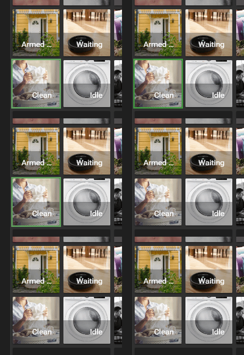
Any way... card-modder can be used to set what height a card should report:
- type: custom:card-modder
  report_size: 7
  card:
    type: glance
    title: 'report_size: 7'
    entities:
      - light.bed_light
      - light.ceiling_lights
      - light.kitchen_lights
- type: glance
  title: Card 2
  entities:
    ...
- type: glance
  title: Card 3
  entities:
    ...
- type: glance
  title: Card 4
  entities:
    ...
- type: glance
  title: Card 5
  entities:
    ...


