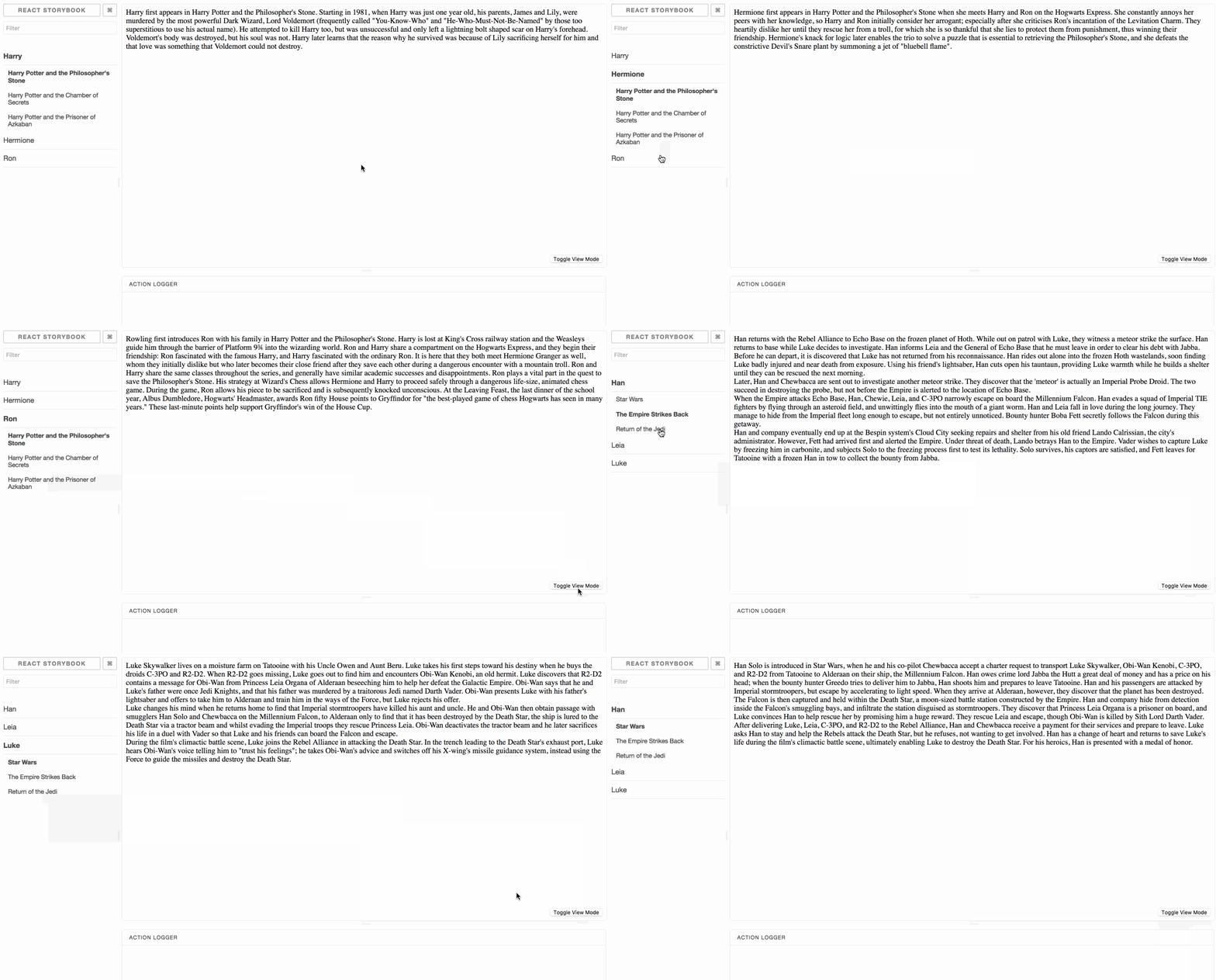
An addon for React storybook that allows you to toggle between different types of stories
You can see the live demo here.
A side note: react-storybook currently does not allow us to add custom content to the manager window except for in the form of a panel. Because I wanted the toggle button to always be visible, I chose to implement it in the preview window. This does mean it gets unmounted and remounted several times. If the ability to add custom content to the react-storybook left panel gets introduced, I would probably update this library to do that instead.
npm install --save-dev storybook-addon-toggleThis package also has react, react-dom, and @kadira/storybook-addons as peer dependencies and require those to be installed as well.
Add the following line to your .storybook/addons.js file:
import 'storybook-addon-toggle/register';If you do not have this file, create it wherever your storybook config.js file lives and add the above line. You might have to include the default addons as well as outlines here.
This may vary depending on your implementation. You can see how I do this with examples and in my .storybook/config.js file here.
Wherever you plan on doing this work (whether it's app-wide or on the individual story level), you must import the WithToggle component as follow:
import WithToggle from 'storybook-addon-toggle';WithToggle then takes four props:
  WithToggle.propTypes = {
    children: PropTypes.node,
    storyTypes: PropTypes.arrayOf(PropTypes.shape({
      type: PropTypes.string,
      stories: PropTypes.arrayOf(PropTypes.shape({
        name: PropTypes.string,
        stories: PropTypes.arrayOf(PropTypes.string),
      })),
    })).isRequired,
    type: PropTypes.string.isRequired,
    renderCustomButton: PropTypes.func,
}This is the story to be rendered to the page. You can apply WithToggle to all your stories pretty easily using a decorator as follows:
  import { addDecorator } from '@kadira/storybook';
  import WithToggle from 'storybook-addon-toggle';

  addDecorator((story) => {
    return (
      <WithToggle type={type} storyTypes={storyTypes}>
        {story()}
      </WithToggle>
    );
});This is an array of objects representing your individual groupings of stories. At each top level object, you have a type attribute representing the group name and a stories attribute that represents the stories matched to those stories. Each story has a kind (the top-level storybook name) and an array of stories (the second-level storybook name). In the demo examples, storyTypes looks like the following:
  const storyTypes = [{
    type: 'sw',
    stories: [{
      kind: 'Han',
      stories: ['Star Wars', 'The Empire Strikes Back', 'Return of the Jedi'],
    },
    {
      kind: 'Leia',
      stories: ['Star Wars', 'The Empire Strikes Back', 'Return of the Jedi'],
    },
    {
      kind: 'Luke',
      stories: ['Star Wars', 'The Empire Strikes Back', 'Return of the Jedi'],
    }]
  },
  {
    type: 'hp',
    stories: [{
      kind: 'Harry',
      stories: [
        'Harry Potter and the Philospher\'s Stone',
        'Harry Potter and the Chamber of Secrets',
        'Harry Potter and the Prisoner of Azkaban'
      ],
    },
    {
      kind: 'Hermione',
      stories: [
        'Harry Potter and the Philospher\'s Stone',
        'Harry Potter and the Chamber of Secrets',
        'Harry Potter and the Prisoner of Azkaban'
      ],
    },
    {
      kind: 'Ron',
      stories: [
        'Harry Potter and the Philospher\'s Stone',
        'Harry Potter and the Chamber of Secrets',
        'Harry Potter and the Prisoner of Azkaban'
      ],
    }]
  }]
I recommend adding viewMode as a property on your story and automatically generating this somehow.
This represents the type of the story currently visible. It should map to one of the groupings described in storyTypes.
This allows the user to override the styles of the button the shows up in the bottom right corner. It is optional. It expects a function of the following form:
  function(onClick) {
    return (
      <button onClick={onClick} ...>Click me!</button>
    );
  }