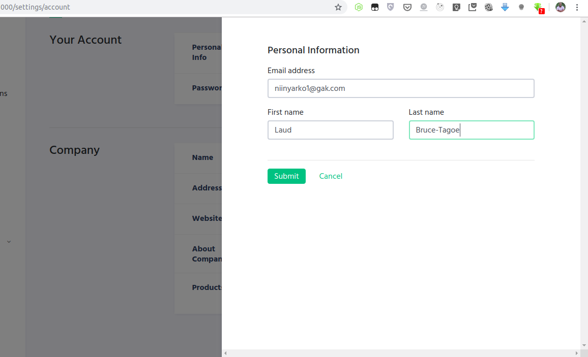
Simple to use sidebar modal based on the Vue JS Modal Plugin
npm install vue-sidebar-modal --saveInclude plugin in your main.js file.
import SidebarModal from 'vue-sidebar-modal'

Vue.use(SidebarModal)
Import css file
@import "~vue-sidebar-modal/dist/vue-sidebar-modal";Create modal:
<sidebar-modal name="hello-world">
  hello, world!
</sidebar-modal>
Call it from anywhere in the app:
methods: {
  show () {
    this.$sidebarModal.show('hello-world');
  },
  hide () {
    this.$sidebarModal.hide('hello-world');
  }
}
You can easily send data into the modal:
this.$sidebarModal.show('hello-world', { foo: 'bar' })And receive it in beforeOpen event handler:
<sidebar-modal name="hello-world" @before-open="beforeOpen"/>methods: {
beforeOpen (event) {
console.log(event.params.foo);
}
}In order to instantiate modals at runtime (for lazy-loading or decluttering templates), it is possible to create modals dynamically.
To start using this feature just include the <sidebar-modals-container /> component it in your project:
<sidebar-modals-container />Call it (the first argument is the component definition, the second are component properties, the third modal parameters, and the fourth the modal event listeners):
this.$sidebarModal.show({
  template: `
    <div>
      <h1>This is created inline</h1>
      <p>{{ text }}</p>
    </div>
  `,
  props: ['text']
}, {
  text: 'This text is passed as a property'
}, {
  height: 'auto'
}, {
  'before-close': (event) => { console.log('this will be called before the modal closes'); }
})
It can also be used with .vue files:
import MyComponent from './MyComponent.vue'

this.$sidebarModal.show(MyComponent, {
  text: 'This text is passed as a property'
}, {
  height: 'auto'
})
You can close dynamic modals by emitting a 'close' event:
this.$sidebarModal.show({
  template: `
    <div>
      <p>Close using this button:</p>
      <button @click="$emit('close')">Close</button>
    </div>
  `
})| Name | Required | Type | Default | Description |
|---|---|---|---|---|
| name | true | [String, Number] | Name of the modal | |
| delay | false | Number | 0 | Delay between showing overlay and actual modal box |
| clickToClose | false | Boolean | true | If set to false, it will not be possible to close modal by clicking on the background |
| classes | false | [Array] | [] | Classes that will be applied to the actual modal box |
| width | false | [String, Number] | 600 | Width in pixels or percents (e.g. 50 or "50px", "50%") |
| height | false | [String, Number] | 100% | Height in pixels or percents (e.g. 50 or "50px", "50%") or "auto" |
| Name | Description |
|---|---|
| before-open | Emits while modal is still invisible, but was added to the DOM |
| opened | Emits after modal became visible or started transition |
| before-close | Emits before modal is going to be closed. Can be stopped from the event listener calling event.stop() (example: you are creating a text editor, and want to stop closing and ask the user to correct mistakes if the text is not valid) |
| closed | Emits right before modal is destroyed |
