-
Notifications
You must be signed in to change notification settings - Fork 4
Holt Winters
We will show below how we can use exponential smoothing to automatically detect anomalies on random time series (here CPU time usage over time).
The following graph shows the CPU time taken by the JVM of a pool of collectors under normal circumstances (graph generated by Arecibo, see “Arecibo Github page”"http://github.com/ning/Arecibo):
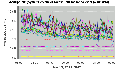
As one can see, we can distinguish two classes of servers:
- Collectors with usage mostly constant over the specified 6 hours
- Collectors with highly noisy CPU process time, with a decreasing trend over time
Let’s focus on the later and pick one of the collectors (referred to as collector1) from the pool.
Here is the time series as plotted in R:

Under normal circumstances, we can verify that the distribution of the iterated difference of the time series follows a normal distribution as shown in the following QQ plot:

The fitted normal distribution is:
\[ X \sim N(-309626.2, 2.47496e+14), \;
\mu = -309626.2, \;
\sigma = 15732005
\]
If we now apply an exponential smoothing technique to the time series (Holt-Winters, with \(\gamma = 0\)), we can see that the smoothed curve fits well:

The Holt-Winters parameters are:
\[ \alpha = 0.1034763,\;\beta = 0.06073856,\;\gamma = 0 \]
To estimate how good the curve fits, let’s take the absolute relative difference between the prediction and the original time series, and smoothing the curve:

The Holt-Winters parameters for the difference are:
\[ \alpha = 0.5915923,\;\beta = 0.2667663,\;\gamma = 0 \]
One can see that our prediction always falls within 22% of the actual value. We have an outlier around data point 45. Looking at the raw data, this corresponds to a spike and we might have wanted to alert on it.
If we draw the normal QQplot of this difference, it follows roughly a normal distribution (except for a few outliers):

Since the difference is evenly distributed across its mean, we can take the approach of using a threshold on the absolute difference to find outliers (and alert on them). We will take this approach on a collector under abnormal circumstances below.
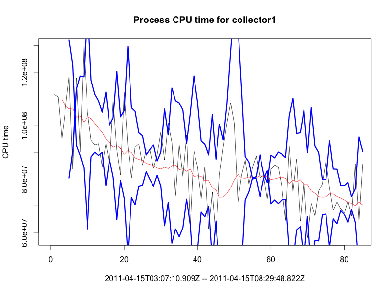
Brutlag suggests to take the weighted average absolute deviation, updated via exponential smoothing, using the \( \gamma \) coefficient, to compute confidence bands. The seasonality factor would “guide” the difference to be in expected ranges.
Here are the bands (\(\delta = 2\)) generated simply by using the exponential smoothing over the difference computed above:
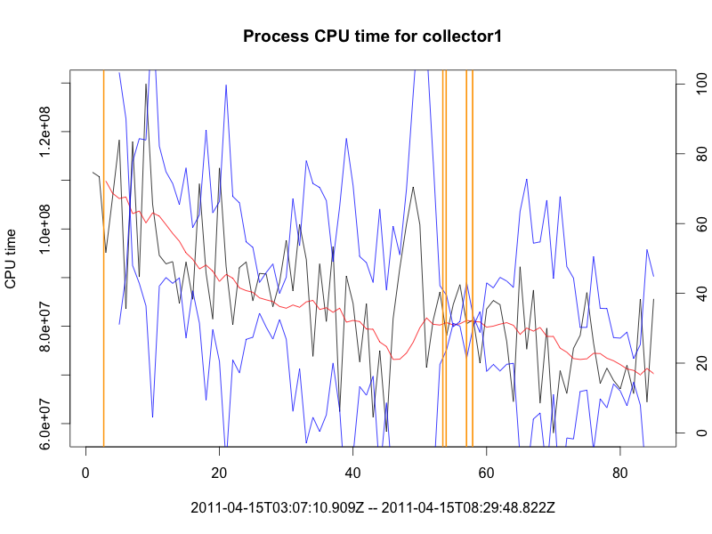
If we alert when the prediction falls outside the band (alerts in orange):
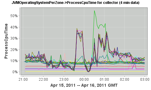
The following graph now shows the same pool of servers under abnormal circumstances:
Looking at the same collector, here is the time series as plotted in R:
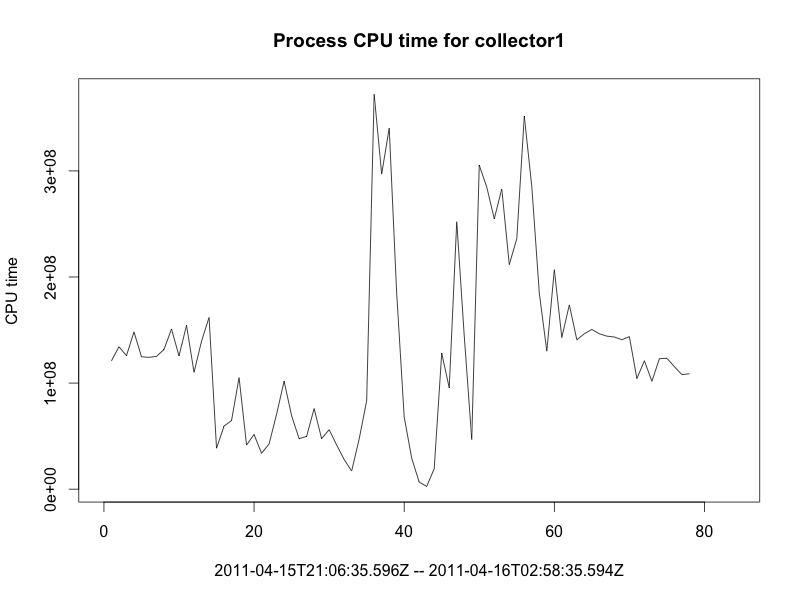
The following QQ plot of the distribution of the iterated differences confirms our intuition (“something is wrong”), as the data collected clearly shows outliers at both the low end and the high end of the range:

If we try to fit the curve via exponential smoothing, the fitted curve is off:

The Holt-Winters parameters are:
\[ \alpha = 0.8170212,\;\beta = 0.01804177,\;\gamma = 0 \]
The fitted curve looks “late” compared to the raw values, since it needs to catch up when the original time series display outliers. The following graph is a zoom of the raw series (blue) and the smoothed series (red) around the first anomaly (data point 35). On can see how the red points are off (the fitted curve is bad at predicting the value around anomalies):

If we now plot the smoothed series of the absolute relative difference between the prediction and the original time series, we can see higher discrepancies compared to the normal circumstances above:

The period during which the collector showed abnormal behavior has been detected (difference above threshold).
The Holt-Winters parameters for the difference are:
\[ \alpha = 0.2763168,\;\beta = 0.1249164,\;\gamma = 0 \]
The QQplot of the difference now looks like:

One can see that we have many more outliers on the low end and the large end of the spectrum.
If we alert when the prediction falls outside the band (alerts in orange):

In this case, we failed to alert on the second anomaly (the first one is caught though).
Here is the CPU usage over time for the same collector:


-
TODO
We need to alert using windows, or the rate of false positives would be too noisy.
If we trigger an alert each time the prediction falls over the bands, the time series would look like (alerts in vertical orange bars):
