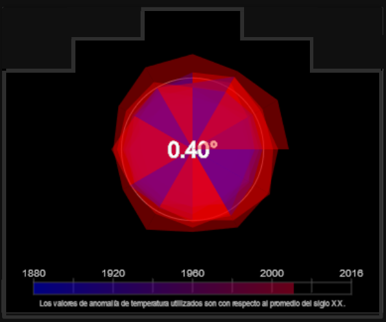
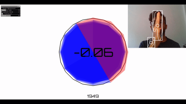
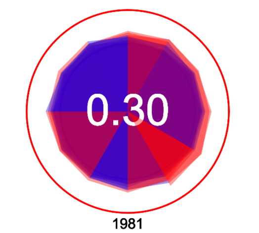
An interactive experience, visualizing temperature anomalies from 1880 to 2016. The strong use of red in accordance with higher temperature anomalies in recent history, attempts to create awareness of the dangerous patterns of climate change that we have seen over the last century. The temperature anomalies used are with respect to the 20th century average. NOAA National Centers for Environmental information, Climate at a Glance: Global Time Series, published May 2018, retrieved on May 27, 2018 from http://www.ncdc.noaa.gov/cag/
There are three versions of the sketch here. One with mouse interactivity in p5js, one made for ProgramaLaPlaza's public screen in p5js and one using openCV for interactivity in openFrameworks.
This work is licensed under a Creative Commons Attribution-NonCommercial 4.0 International License.
OpenFrameworks version, using openCV for interactions
OpenProcessing version (seen here)
ProgramaLaPlaza Version (seen here)