This is the latest version of the Uniform Component Starter Kit (CSK) - version 6, built specifically for Next.js 15 App Router leveraging React 19, TailwindCSS and TypeScript.
If you are looking for the Next.js Page Router version, check out this older repo instead.
- This version is built specifically for Next.js 15 and React 19, leveraging the latest Uniform SDK v20+, enabled for all the latest Uniform DXP features!
- Minimalistic and simplified approach:
- zero external dependencies besides @uniformdev, minimum distractions - essentials only in the core version.
- Zero components added by default, can add components into your codebase with
npm run component:extractand customize how you see fit - More templates and solution recipes coming as stand-alone packages.
- Revamped theme management system based on a new Design Extensions integration that supports design tokens
- More atomic components supporting the authorable components paradigm
- Internationalization / localization ready
- Removed daisyui
- Included standard sitemap implementation
- Server-side rendering by default. Static site generation can be enabled on top.
- Dev Experience updates:
component:scaffoldandcomponent:extractflows, watch mode for design extension update sync and a developer config for content sync that scopes the operation to developer artifacts only.
Check out more about it here where you can copy and paste components from right into your project!
- A Uniform account with the ability to create a new empty project. If you don't have a Uniform account, you can request a trial account here.
- Node.js LTS and
gitinstalled on your machine.
Run npx @uniformdev/cli new and pick Next.js -> Component Starter Kit from the interactive prompt. Complete the process to deploy a new instance of CSK to your
git clonethis repo.- Create an empty Uniform project in your team.
- Setup your .env file using your Uniform project connection details (see .env.example for reference)
UNIFORM_PROJECT_ID=
UNIFORM_API_KEY=
UNIFORM_PREVIEW_SECRET=hello-world
Make sure your API key has "Developer" role to be able to push content.
npm installto install dependencies- Run
npm run initto initialize your project.This will push all content from disk (
.\contentfolder) and your design settings (colors, fonts, borders, etc. for this default theme).
Use npm run dev to run locally.
At this point, you should be able to browse your site on http://localhost:3000 and open the Home composition in your Uniform project to start visual editing your content.
This integration brings new parameter types for design and layout control via Uniform UI extensions to help control and manage the look and feel of your components.
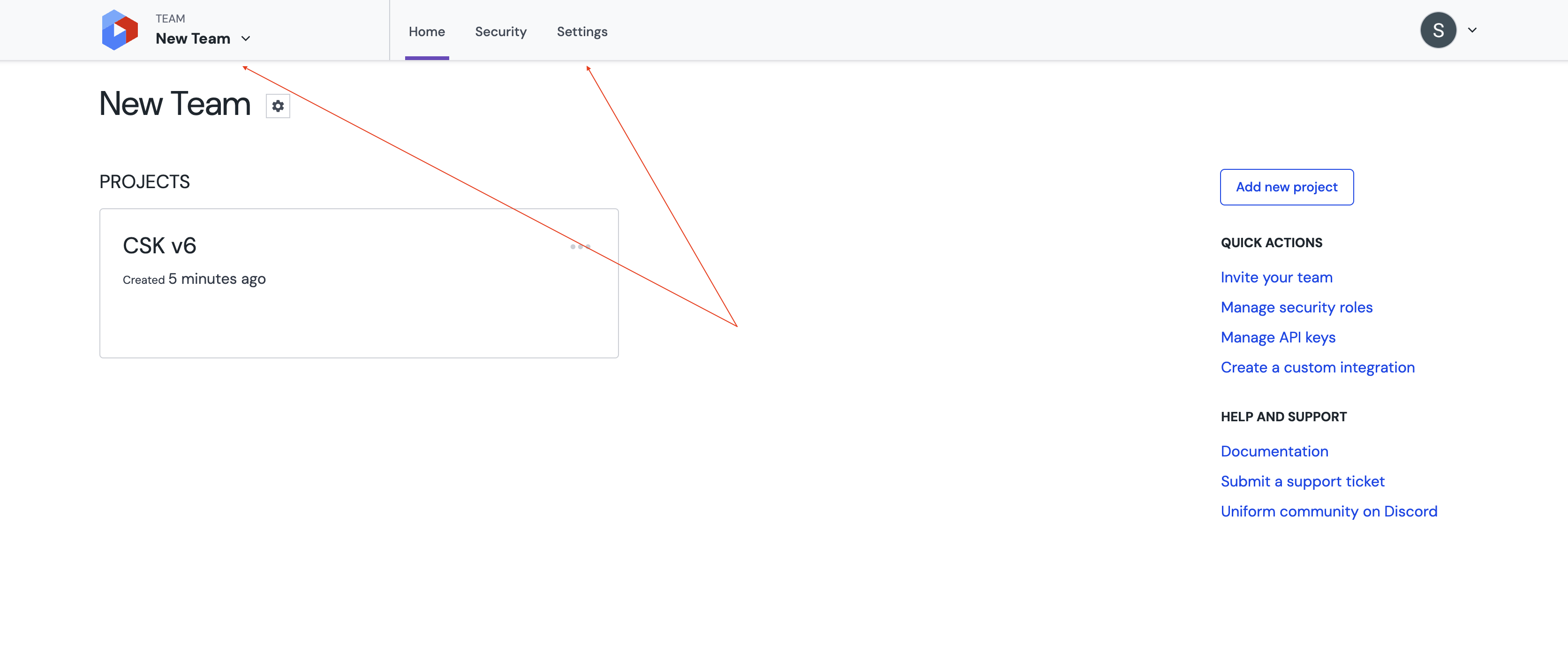
- Open your current team page.
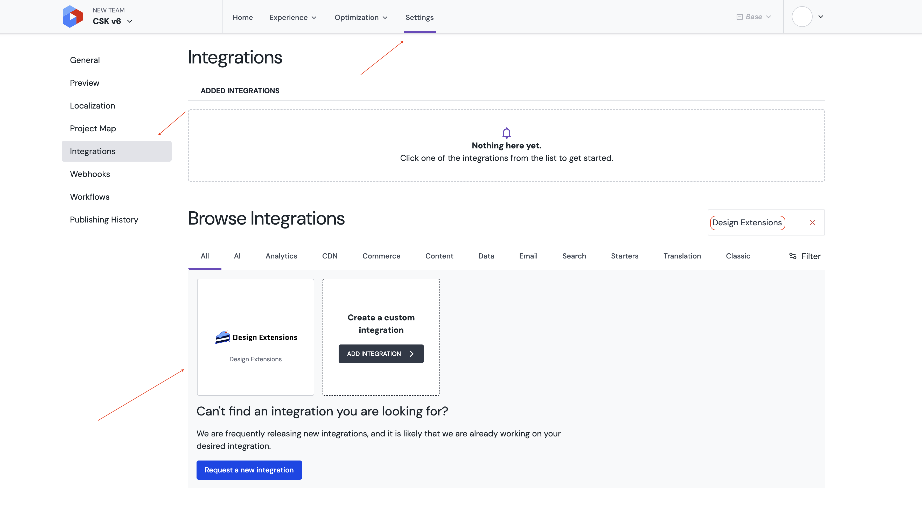
- Navigate to the
Settingstab, thanCustom Integrationsand addDesign Extensionsas a custom integration using this manifest. - Open your project.
- Navigate to the
Integrationstab, find theDesign Extensionsintegration and install it.
The following scripts are created to facilitate sync of content between the ./content folder and your project.
- Run
npm run push:contentto push data from disk (see./content) to your Uniformproject. - Run
npm run pull:contentto pull data from your Uniform project to./contentfolder.
Alternatively you can use npm run pull:content:dev and npm run push:content:dev to pull and push developer-owned content to your local project. The scope of the developer-owned content is defined in the uniform.config.dev.ts file.
Developer-owned content typically scoped to components, content types, component patterns but can vary based on the stage of your project lifecycle and your preferences. For example, at some point, you may not want to sync assets like images, videos, etc.
Whenever you add new colors, dimensions, fonts, or borders, your application should recognize these values. To ensure this, you need to run:
npm run pull:dexThis command is automatically executed when running:
- Development mode:
npm run dev:watch
- Build process:
npm run build
When modifying an existing value, your app will automatically fetch the updated configuration in two cases:
- If you are in preview mode (within the canvas).
- If the WATCH environment variable is set to
true.
If you prefer managing styles manually, you can modify the predefined configuration files located in the styles/ directory:
styles/border.cssstyles/colors.cssstyles/dimensions.cssstyles/fonts.css
After making changes, push the updated configuration using:
npm run push:dexThis will update the Design Extensions Integration with your new styles.
When developing an application that supports dark mode, ensure that your integration recognizes dark theme colors by defining them inside the .dark class:
.dark {
  --text-primary: #752b2b;
  --text-secondary: #391717;
  --text-tertiary: #6f5454;
  --text-light: #ed1616;
  --text-dark: #3e867d;
}
This ensures that the Design Extension Integration correctly identifies and applies dark mode styling.
By default, the Design Extension includes two predefined groups:
buttontext
When your project is still using the default configuration, the allowGroups.json file will be empty. However, if you add a custom group (e.g., page), it will be added to this file automatically.
If you introduce a new group, such as page, the allowGroups.json file will be updated as follows:
{ "color": ["button", "page", "text"] }You can define your own groups and push them using:
npm run push:dex🔹 Important: The Design Extension Integration will only display a group if it contains values.
To assign a design token to a specific group, the token's name must be prefixed with the group name.
For the page group to be recognized, you should define colors using the page- prefix:
--page-background-primary: #ffffff;After this, the token will be correctly linked to the Page section in your Design Extension Integration.
Currently, grouping is supported for:
✅ Color tokens
✅ Dimension tokens
- Run
npm run uniform:publishto publish the manifest with A/B testing and personalization configuration.