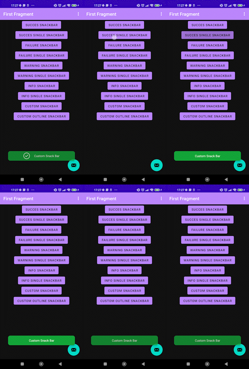
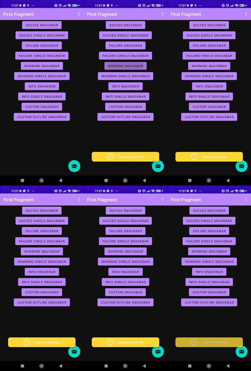
Using the native android class of snack bar. This custom snack bar will help you display much more personalized app toast. You can change the color, add an icon, outline on the toast and much more.
Success SnackBar
Failure SnackBar
Warning SnackBar
Info SnackBar
Custom SnackBar
Step 1. Add it in your root build.gradle at the end of repositories:
allprojects {
	repositories {
		maven { url 'https://jitpack.io' }
	}
}
Step 2. Add the dependency:
dependencies {
	implementation "com.github.xavijimenezmulet:SnackBar:$latest_version"
}Two types of snack bar can be used. By type or custom:
These are the existing types:
enum class Type {
 SUCCESS, FAILURE, WARNING, INFORMATION
}
You should call this method from StyleableSnackBar:
/**
 * Creates a snackBar instance with custom duration and color
 * @param viewGroup view group of the caller
 * @param text to be used as the message
 * @param type specifies the image and background to be prompted
 * @param long duration of snackBar false if you want short
 * @param context current context
 * @param showImage to show image (optional) default is true
*/
fun snack(
	 viewGroup: ViewGroup,
	 text: String?,
	 type: Type,
	 long: Boolean,
	 context: Context,
	 showImage: Boolean = true
)
Now we are going to show an example of snack bar setting to FAILURE with image:
StyleableSnackBar.snack(
	 requireActivity().window.decorView.rootView as ViewGroup,
	 "Custom Snack Bar",
	 StyleableSnackBar.Type.FAILURE,
	 true,
	 requireContext()
)
This will show a failure snack bar with failure icon (you can look on presentation gifts).
You should call this method from StyleableSnackBar:
/**
 * Creates a custom snackbar with the selected elements
 * @param viewGroup view group of the caller
 * @param text to be used as the message
 * @param backgroundColor the snackBar background color
 * @param image image to be used in the snackBar (optional)
 * @param tintImage color of image set (optional)
 * @param long duration of snackBar false if you want short
 * @param strokeColor the outline color (optional)
 * @param strokeWidth the outline width (optional)
*/
fun customSnack(
            viewGroup: ViewGroup,
            text: String?,
            backgroundColor: Int = R.color.black,
            image: Int? = null,
            tintImage: Int = R.color.white,
            long: Boolean,
            strokeWidth: Int = 0,
            strokeColor: Int = R.color.black,
            context: Context
)
Now we are going to show an example of custom snack bar:
StyleableSnackBar.customSnack(
	 requireActivity().window.decorView.rootView as ViewGroup,
	 "Custom Snack Bar",
	 R.color.purple_500,
	 R.drawable.ic_launcher_foreground,
	 R.color.white,
	 true,
	 2,
	 R.color.styleableYellow,
	 requireContext()
)
You can download the code and try the example as shown in the presentation part.
- Initial Build


