forked from williamclot/character_creator
-
Notifications
You must be signed in to change notification settings - Fork 4
React
William CLOT edited this page Sep 20, 2018
·
1 revision
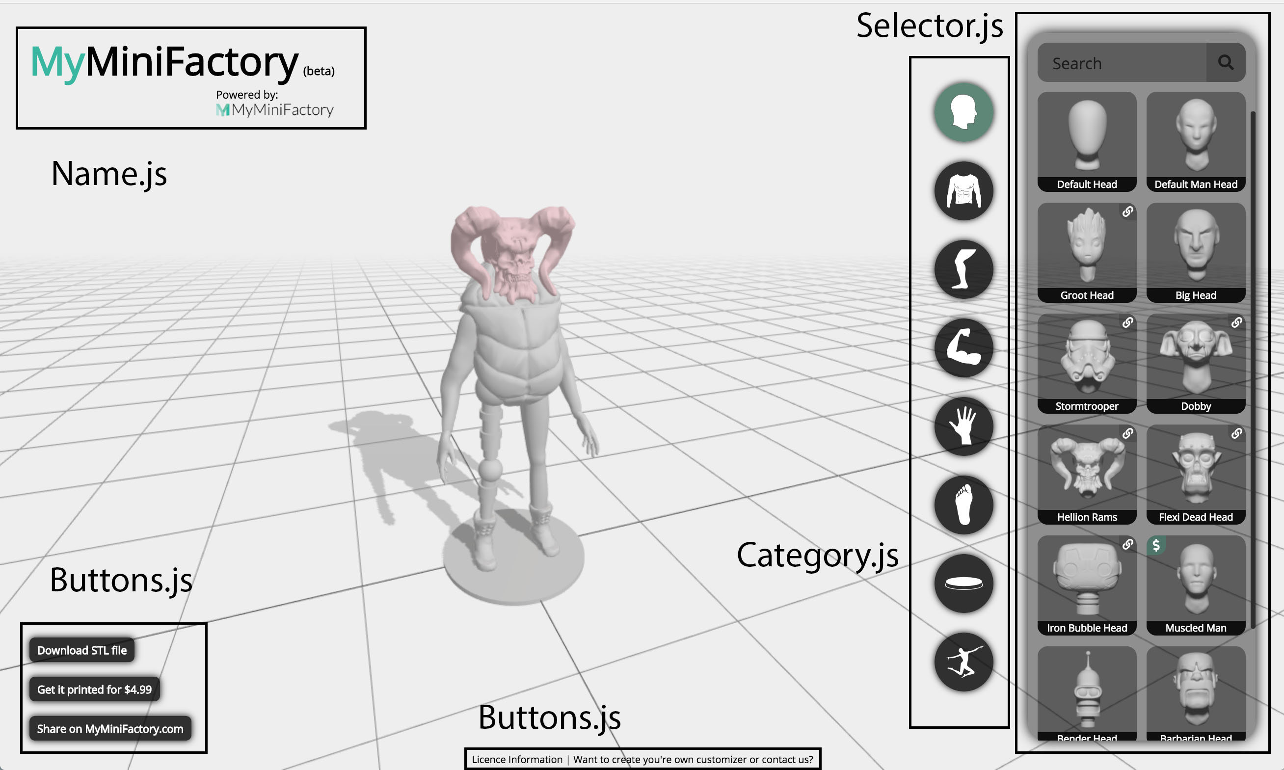
The UI of the customizer has been coded using the React framework. All the code relative to the UI can be found inside the /src folder. I tried to divide the UI in several React components to help you understand the code as easily as possible. Here is a quick overview of the main components:

-
Name.jswill display the top left name of the customizer. -
Category.jswill display the different categories of objects (Heads, Torsos, Arms, Hands, Legs, Foots, Poses and Stands). -
Selector.jswill display the actual library of content in each category. -
PageLoader.jsis a loader (with the rotating logo), when the page loads, similarlyLoader.jsis a loader for the MMF upload, andPartLoader.jsis a loader for loading each meshfile. -
Buttons.jsis responsable for the buttons on the bottom-left corner. -
Popup.jsis a component used to display all the popup messages. -
Footer.jsdeals with the small footer copyright information.
I recently added a component called SearchBar.js which filters the elements inside the selector depending on the content of the search text.
MyMiniFactory | 2018