-
Notifications
You must be signed in to change notification settings - Fork 25
SimResults
The XLRisk simulation results are discussed here in the context of the worked example. The simulation results sheet named "Risk Results 1" contains the following:
- 1. Sampled values of input cells
- 2. Calculated values of the output cells
- 3. Simulation statistics
- 4. Percentiles
- 5. Percent Rank
- 6. Correlations
- 7. Graphical Output - Cumulative distributions
- 8. Graphical Output - Distributions
- 9. Graphical Output - Tornado diagram
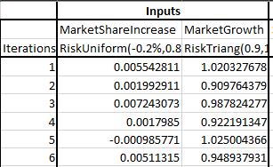
Input cells are the cells containing risk distribution functions. The first columns of the results sheet under the heading "Inputs" contain the sampled values of the input cell for each iteration. The cell address or name, if the cells containing input distributions are named, as is the case here, and the formula of each input cell are displayed at the top of each column.
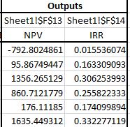
The value of each output cell is stored in each iteration. The columns under the heading "Outputs" contain the calculated values of the output cells for each iteration. The cell address and output name are displayed at the top of each column.
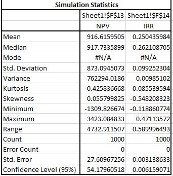
For each output cell, a range of statistics are displayed including the mean, the standard deviation etc.
In addition the percentiles of the distributions of the output cells are displayed from 0% to 100% by 5%.
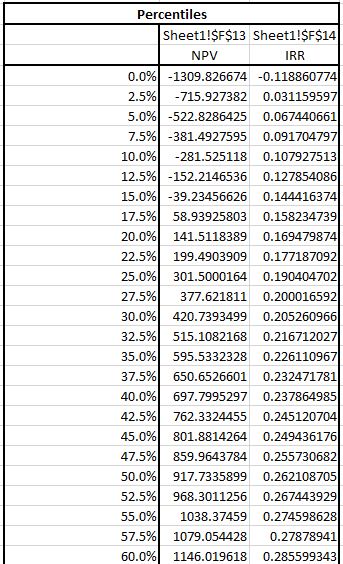
PERCENTRANK is an Excel function that calculates the proportion of the values of a specified range tha lie below a given range. In the "Percent Rank" section of the simulation output you can perform such a calculation for the output distributions. For example you may want to know the proportion of the iterations that resulted in negative NPV. If you enter the value 0 below the NPV then, in the "% rank" row you will see a value close to 15.7% which is an estimate of the probability of negative NPV.

The correlations table shows for each output cell the correlations of the simulation results with the samples of the input distributions. This helps assess the relative impact of the input distribution to this particular output. A positive correlation indicates a positive impact and a negative correlation a negative impact. The larger the the absolute value of the correlation (0 to 1) the largest the impact.

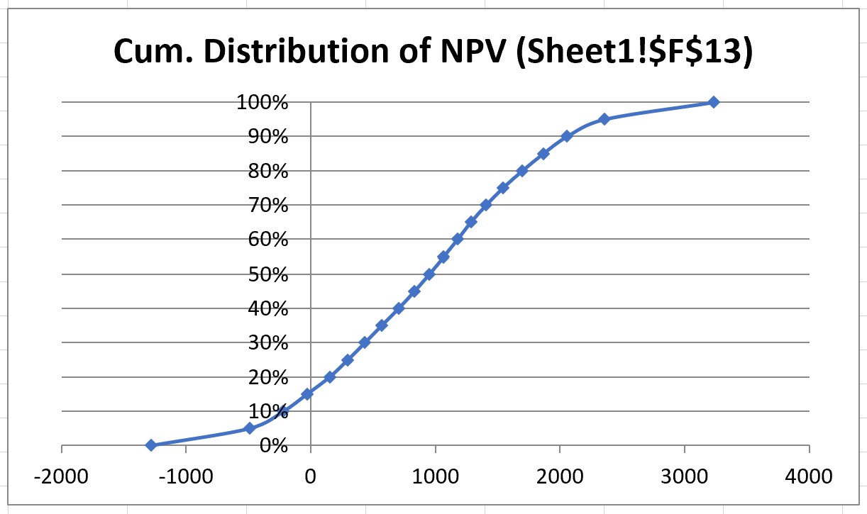
For each output cell a cumulative distribution is created as the one below for the NPV.
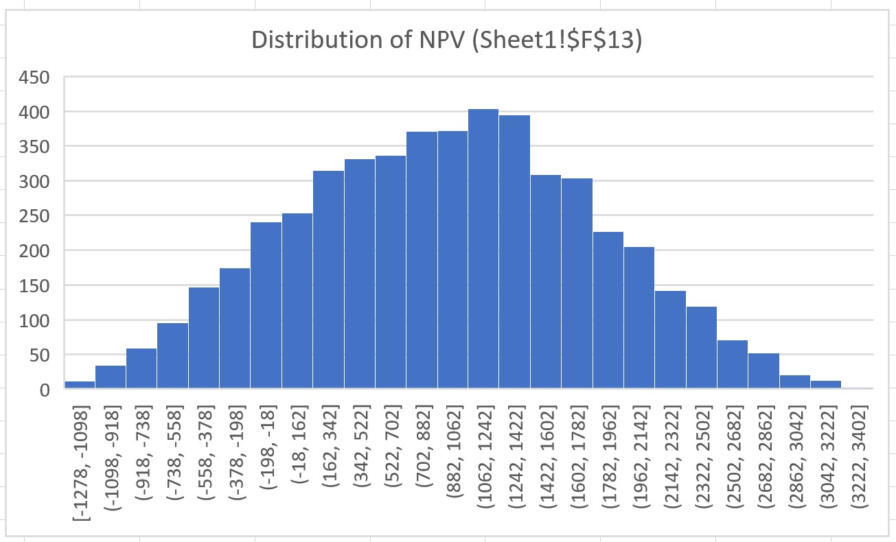
In addition and if you have Excel 16 or later, a histogram is created for each output cell as the one below for the NPV. You may want to manually adjust the number format of the X-axis (bins).
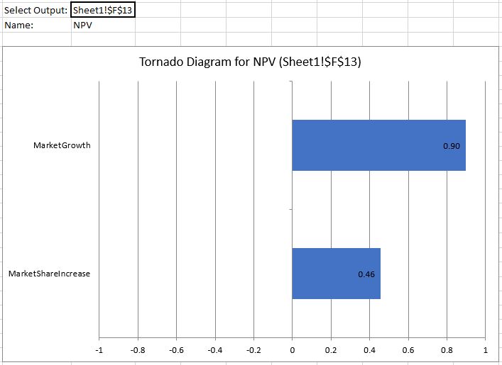
The tornado diagram presents the correlations between the results of an output variable and the sampled values of the input distributions (see section on correlations), ordered according to impact, i.e. the absolute value of the correlation. Thus the most imprant risk drivers appear at the top of this graph. You can select which of the output variables to display from a drop down list above the graph.
